It’s no secret that there are good and bad ways of animating. You can either imbue meaning into a transition, or completely, utterly disorient someone. Google’s page on meaningful transitions is perhaps one of the clearest explanations of this principle as it relates to interfaces.
Animation’s role in web and UI has taken more of the spotlight in recent years. From the rise in CSS and canvas-based animations on the web to Google’s new animation-centric design philosophy, we’re starting to showcase the idea that can actually improve an interface design by showing how elements on a screen move from one state to the next.
Assuming that more and more of our screens will be animated, and that transitions will play a bigger part in our experience with screens, what are some principles we can take from animation history and usher into our modern world of user interface design? The art of animation has a rich, 100+ year history to pull from, and it would be remiss to not carry at least some of it into today.
The First Films
Animation followed on the coattails of film in the final years of the 19th century. Silent film graduated from being a mere carnival amusement into what would become a cash cow industry in a decade. Animation, however, suffered a much longer experimental phase in culture even though the oldest surviving example of animation dates back to 1899—a time before Americans had even seen a movie at their local Nickelodeon.
But of all the examples we could pick from the dawn of animation, we’ll just pick from two that have impact on design: J. Stuart Blackton’s Humorous Phases of Funny Faces (1906) and Winsor McCay’s Gertie the Dinosaur (1914).
You only have one chalkboard
This wasn’t the first animated effort by the father of animation, J. Stuart Blackton, but this is a milestone in animation history nonetheless. Imagine seeing this a hundred years ago—it must have felt like a dream, watching drawings move and animate before one’s very eyes! By now, people had seen, but were still adjusting to, this new spectacle called film that allowed them to re-watch a part of history. Seeing artwork move, then, might have been even more of a spectacle in 1906.
It’s no surprise that Blackton got this spark of creativity from drawing on a chalkboard—it’s quite a malleable, erasable, forgiving surface. And remember that Blackton was more or less on his own, figuring all these concepts out for the first time. Imagine making drawings ad-nauseum, thousands and thousands of times over, with only minute differences in between them. I’m sure in his experiments, drawings that were wildly different from each other resulted in a jarring, confusing experience to watch. And I can imagine his excitement and dismay upon learning how closely each frame needed to be to its neighbor in order to be perceived as motion. Which brings us to:
Principle 1: Animation must be fluid Animation between two things must be fluid in order to be perceived as motion.
Humorous Phases of Funny Faces (1906)
Ok, ok—a landmark in fluid motion it’s not, but you can still perceive the film as a character in motion (barely) rather than an unrelated series of drawings. So in that right, it serves as a low-end benchmark for what the brain does and doesn’t perceive as motion (the film was animated in 20FPS, by the way). If you don’t perceive that as fluid motion, then let that be an example to you what 20FPS looks like!
In addition to that, I’m sure he had a second epiphany while working on this project, possibly much earlier: he only had one chalkboard to draw on. When he draws a cigar on a face, he has to erase part of the face. When the cigar blows smoke over the woman, that part of the drawing must be sacrificed. The question, then, is how do you obscure things while still keeping everything in view?
Notice that in the film whenever something is obscured one time, it’s obscured forever (except for the cut-out parts with the clown). When the cigar appears and obscures the face, it doesn’t go away. When the woman’s face changes, it never changes back. I’m talking, of course, about the destructive nature of chalk, but the principle is that whenever a new thing is shown, an old thing must be covered up. Because, to a viewer, something that’s obscured may as well be gone forever.
How do you obscure something while still keeping it in view?
How Blackton got away with this is obscuring in small, incremental steps. In UI, you can easily reverse showing / obscuring, but even with the ability to “rewind,” the association between two states is lost entirely if there’s no incremental explanation of where something came from and how it got there.
Principle 2: Animation tells a story Whenever A replaces B, animation must show the history of A becoming B.
Remember: you only get one chalkboard. You can either fill it with drawings that have no relation to one another, or you can tell a story with fluid motion. Animation shows how your initial state gets morphed into something else, and is a form of explanation that requires no words. If done properly, it can be a huge tool for explaining how every thing on a screen got to be where it is. This is true for every state in a design.
The Wonder of Interaction
When was the last time you’ve played with a baby or a small child? Have you noticed how simple it is (mood permitting) to get them to smile? Even the smallest interaction from you will cause their face to light up: there’s a delight in seeing they’re interacting with a real, live, other person.
That never really goes away; even though we take certain digital interactions for granted we still glean pleasure from act of play and from new experiences. We all still find that sense of play in one thing or another, and at the core of play is interaction.
Winsor McCay’s Gertie the Dinosuar (1914) is nothing short of masterful. Many claim it to be the first significant animated work in history, and it still holds its appeal a hundred years later. The more you think about how long the film is, and how many drawings went in to make this (yes, every frame—background and all—is a separate drawing; he did actually draw everything on each frame from scratch every time), it’s staggering to consider the amount of thought that went into the process alone. Add to that the magic way the drawing interacts with the audience, and you have something golden.
The film actually came from McCay’s Vaudeville act, where he would show the film in front of an audience and presumably interact with both the audience and, seemingly, the film itself. There is still a disconnect between the viewer and reality: the viewer is not fooled into thinking this is an alternate reality. But that is not the goal. Rather, this film demonstrates that a viewer can interact with another world they could never be a part of. And, in addition to the childlike sense of wonder it evokes, gives empowerment to the audience to believe that they, too, can interact with something altogether new.
This is only possible through the act of motion: we can connect the dots of our interactions only if we witness the result from start to finish. When McCay tells Gertie to raise her foot and we see her rise up in response, we get that feeling of breaking through the barrier between our world and hers. We watched it happen! Conversely, if it were just a still frame showing a dinosaur with a raised leg, we get the sense that the dinosaur was always doing that, and we had no part in it. It feels much like coming home to a broken pot on the floor. Did I slam the door too hard walking out, or did the dog jump up on the shelf? Or rather yet—was it an earthquake while I was gone? Or did a screw slip a little bit on the shelf? Forgive this crude example, but this point was raised to illustrate a scenario in which we are aware an event occurred, but are confused about our role in the happening of said event. We feel less of an active participant and more of a passive observer.
Principle 3: Animation proves interaction Animation shows us the difference between what we actively engaging with, and what we are passively observing.
McCay’s subsequent work in animation would go on to inspire other studios to expand on this exciting new storytelling device, most notable of which was possibly Disney. There are so many things now possible with the advent of animation that would be impossible, or, at best, hokey to the medium of live-action film. Drawing and painting have been a part of the human experience for all of recorded history; 2D art has always been a means through which to express things loftier than reality itself—visions of heaven and worlds beyond. It’s no wonder, then, that animation in the following years would coalesce into a rich collection of fantasy and supernatural stories.
Animation [within UI] makes us feel like more of an active participant, and less of a passive observer
Let’s back up for a second before we get too ahead of ourselves: yes, animation, like art, can express the everyday occurrences and can reflect things that are true-to-life. And let’s not pretend, either, that the genres of fantasy and science fiction never existed in live-action. But there is a fundamental split between live-action and animation. Live-action derived from photography, from objective documentation, from depicting reality; whereas animation derived from art, some of it realistic rendering and some of it abstract and/or artistically expressive. So given its nature, animation trends toward expressive over the realistic.
But where am I going with all this? Weren’t we talking about design? Or dinosaurs? I forget. I don’t mean to wax poetic on the narrative properties of animation; only to remind us that, most importantly of all things we can learn from traditional animation, is that animation inspires us to be human. Was all that buildup for—that? That fluff? It may sound cliché, but it’s true. Animation is a purely human-made craft, created to show us human-inspired stories both from reality and the imagination. Who among us weren’t inspired by at least one animated children’s movie? It wasn’t the artwork that inspired us, although there are films that exist that can be called “high art” by anyone’s standards. No, it wasn’t the artwork so much as the excitement of getting to see supernatural (non-realistic) characters coming to life. The magic of animation is imbuing life into something lifeless.
Principle 4: Animation breathes life Animation can bring lifeless objects to life if the motions mimic life itself.
Gertie the Dinosaur, 1914
Now, that shouldn’t ever be interpreted as everything must move. No, how horrible that would be if everything was constantly moving! But as McCay reminds us—as well as all of the history of animation—we get a sense of wonder and magic from something moving about that we don’t find in still images.
One last point, and then I’m done: I don’t want to confuse animation with live-action here, since live-action has just as much story power as animation does. But remember: with animation, things can move that otherwise could not in live-action. And—just as we live oftentimes with one foot in reality and one foot in our own imaginations, we have access to a new level of communication when we aren’t bound by physics and realistic constraints. And what that means for design—which leans more toward imagination than realism—is that life and inspiration can be breathed into dead, dusty designs simply through life-inspired animations.
TL;DR
Animation must be fluid in order to be interpreted as movement
Animation tells a story, and must connect the dots between A becoming B.
Animation proves interaction by showing us how we interact with another (digital) world
Animation breathes life into lifeless objects by mimicking life itself.
No doubt you found this post because you’re looking for how to get set up with using Grunt to improve your workflow. Or something. Not really sure why you need Grunt? Great! Want to cut down on fluff and just get a minimal setup? Awesome! Both of you: keep reading.
If you want to read manuals about all it can do, go away and read the Grunt docs. This post is for the I-don’t-care-just-make-it-work crowd.
We’re going to be watching CoffeeScript files from a directory, then automatically compiling them as we work into one JS file (which is impossible with the CoffeeScript compiler alone). If you’re not sure why you need Grunt, this is why: it performs tasks in the background while you work, and can push around/move files as you need to. So, it’s like CodeKit? Yes, it’s like CodeKit. Only, you have more options available to you, and it’s much faster and more powerful, especially if you’ve experienced CodeKit hiccups / crashes as I have (to clarify: CodeKit is great; I love it. It’s an amazing program. But it doesn’t have a 100% success rate for what I need it to do).
cd into your project’s root folder. Grunt will install some files in there that it needs. For the rest of the tutorial, we’ll be working in your project’s root directory.
Note: many people use Gruntfile.js, but .coffee works all the same. Whatever your preference. Oh, and yes, the first letter is capitalized if you’re following convention, but it will still work if it’s not. N00b.
Step 5: Run
From your project root folder, after everything has been set up, simply run
grunt
to loop through all the tasks one time only, or
grunt watch
to have grunt run continuously as you work. Simply modify your watch task and add more commands to the array under tasks to taste.
Done!
Debrief
To put things lightly, I told you wrong on a few things. What? That’s right. In order to truly provide a no-fuss setup, I gave you one of the many possible setup options you could take, and there are a number of alternate, more “tweakable” routes you could take to manage Grunt a bit better. It’s wrong in that I could have added more steps to give you a more flexible system, but I minimized the steps and gave fewer options to get you up and running faster. I thought I told you nay-sayers to just go read the docs!
Some likely objections I’ll hear to this approach:
This skips grunt-cli like the Getting Started guide specifies
You didn’t mention package.json
All to which I would say: you’re right. You’re absolutely, absolutely, right. But these are optional for non-Node sites, and were omitted simply because you can get away with skipping this. I also know you can manage Grunt versions better, but all these are bridges to cross when there are version conflicts, a higher-level problem to solve than simply compiling and getting on your way to making websites.
… And, done! That’s it: behold your repo, without those hideous .psd files.
Warnings
Note that the example code removes all .psd files recursively. So if instead of *.psd, you accidentally ran *, you’re freaking toast. Be careful. A better alternative, especially for specific files, would be this:
What this does is recursively checkout your repo at every commit, run that command, then re-commit. Basically rewriting history. As you might imagine, looping through your entire history might take some time, and in bigger repos, you’d be right.
You can run any command within the quotes, but the given command works wonders for any rogue files that creeped their way into your git repo and stank up the place.
In my specific instance, a mess of unnecessary .psd files were accidentally included with a git add * by someone else in the initialization, and I had been working with the repo for some time without noticing the filesize. I had been working on it for a couple months, and this particular commit in question stretched back 2 years from present date. Needless to say it couldn’t be ignored.
Running this turned by repo from 2GB down to 93MB in just a couple minutes! Naturally, it wasn’t the only file, so after cycling through the process a few times with some binary files that truly didn’t need to be tracked, I eventually got my Repo down to literally 1% of what it was.
Credit
Full credit of this method goes to this blog post. Be sure to scroll down to Commands and Output; if you start at the top it won’t go so well.
Further References
Removal of large files (where the code came from; scroll down to find the right command)
BFG Repo Cleaner, a very, very popular alternative that is much faster. This would have been overkill for my case, but the next right step if this method fails for you.
Not just any element will do; it has to be the right element for the job. Even though the web is changing fast, it’s important to know what things mean in 2014. I wanted to organize a flowchart simply for my own understanding, but I thought that publishing it would help other people out as well.
Thanks to HTML5 Doctor for writing such beautiful summaries of the ever-authoritative but unrelentlessly-daunting W3C spec.
Browser Testing. The words hang in the air like the smell of a summer trash day in Manhattan. The sound of these words causes any front-end developer’s eyes to roll back into his/her head a little, followed by a pronounced slouch and sigh.
This doesn’t work in IE8. This doesn’t animate in Firefox. These fonts look weird in Webkit. You can’t use this; that’s experimental. Vendor prefixes; unsupported standards.
“But—” I’ll hear you say, defending your favorite platform. But when you take a step back, you realize even your beloved rendering engine has flaws. Just like a loved one, they’re not perfect; you learned to love them so much you ignore their flaws, and focus on how you can do better to them. They can do no wrong.
Actually, no—that’s not quite right. People aren’t quite that committed to a browser. Browsers change popularity over time. Heck, the Browser Wars are still raging, some may say. Still, many people can get as fanatical about a browser as they can their favorite NFL team. Yeah—that’s good. Sports teams are closer to what I’m talking about.
But stepping back further, as a front-end developer, I ask: does browser testing even make sense? Why in the world would we want to test browsers if we didn’t have to?
The River
Back from the time Windows XP was released in 2001 until Firefox started picking up steam in 2008, there was really only “one” browser: Internet Explorer. You designed websites for Internet Explorer. You tested websites in Internet Explorer. You decided what was and wasn’t possible based on… Internet Explorer.
What was the problem here?
The problem, as designers soon noticed, was that you couldn’t design for web. At least, not like you could with print. Embedded fonts? Forget about it. Images that weren’t rectangles? Nope. CSS styling? JavaScript? Well, kinda, but don’t get your hopes up. And don’t even get started on security.
There was a bit of a standstill here in improvement. Sure, it’s the internet, and it was still developing at an astronomically fast pace. But it wasn’t until Firefox stole some of IE’s thunder that the rains came and the flood gates of competition burst forth, releasing a river of new ideas and capabilities. Both users and developers began to see the light about what web standards could actually accomplish.
Before we knew it, we were doing inconceivably crazy things! Things like letting the browser validate forms. Letting CSS handle hover images. Oh, and my personal favorite: ditching <table>s. It was a Renaissance of sorts, and a new beginning to how we viewed the web. We even came up with a stupid name to show our excitement: Web 2.0(man, were we young back then!).
The Wetlands
Sounds like a dream, right? Well, sure. I’m amazed everyday at the things that are happening on the web. And it only keeps getting better! Web has almost caught up to print in terms of design, limited only by things like threading text (continuing content from one container to another) and hanging punctuation (obviously, I’m omitting the interactive parts of the web that print can’t physically obtain).
Writing code that works for every browser is hard. And when impossible, writing browser-specific fixes is time-consuming.
But in spite of this veritable cornucopia of web-goodery, there exists the opposite edge of the sword: browser testing. No longer in the droughts of monopolistic browser reign, the rivers of openness have come, only to flood everything in sight. The nature of browsers now is more like an endless bog of vendor-specific rules.
Isn’t that a bit dramatic? I mean, there are only, like, 4 main browsers†.
True, and it’s worth noting that out of Chrome, Firefox, Internet Explorer, and Safari, two of them use webkit as their rendering engine. But still, writing code that works for all four is hard. And when impossible, writing browser-specific fixes is time-consuming.
† I would’ve said Opera if it hadn’t been losing so much market share lately, and if it would have not switched to Webkit.
An example of time-consuming: I was animating an SVG the other day. I had embedded the SVG code onto the page, and I was only animating certain <path>s within the SVG. Webkit let me rotate those paths along the edge. Gecko (Firefox) did not, and I had to split up the SVG into two files and re-code the animation. So, end of the world? Nope. But was it necessary for both to support SVG but have each cherry-pick implementation? I feel like it could be better.
The Lightning
So, to answer the question you thought I’d abandoned in my rant: Why do we need more than one browser if we have to test? Is Webkit all we need? I will say this: it is the competitive nature of having different browsers that has led us to develop the web at the fastest pace.
Put another way, we’re all trying to solve a problem: what is the best way to share this interactive experience we call “the web”? So far, things like HTML, CSS, and JavaScript have evolved organically as great solutions to this problem. Could there be more solutions? I would most definitely hope there would be. But for now, focusing on these simple problems—what they even are, and how they can be more interactive, has proven quite difficult. And we’ve only been working at this for a couple decades! Imagine how much farther we have to go!
If we look at it in this way: trying to solve a problem by hitting it from different angles, we’re sure to come up with a much better solution to our problem than if we approach it from one side. So if we can get there faster by having more examples of what a browser could be, then I say, yeah. It is totally worth browser testing.
I’ll leave you with this, and this is the principle of attacking a problem from multiple angles at once: lightning. The most efficient exchange of electrons between differences in charge between the sky and the ground involve multiple—thousands of exchanges trying to find the quickest connection between earth and sky.
The fastest, most efficient route wins. Eventually.
There are two related questions to which I’ll give the same answer:
1. I ran the command gem install mygem from the Terminal in my project folder. What happened to the gem? Why Can’t I use it?
2. I have a Rails project, and I don’t want all my gems being packaged with my Rails project. How do I pick which ones get used?
The answer to both is the same:
The Gemfile
Your Gemfile (located in your rails root folder) is a list of every gem your Rails app needs to run. Your rails app won’t start including anything but default gems unless you add it here.
So when you run a command like gem install sass, nothing will happen to any of your rails projects. Instead, your global Ruby installation will simply have that Gem available to use in any of your projects, but won’t actually include that gem unless it’s actually written into a Gemfile somewhere. But in order to understand gems a little better, let’s spend a little time on the string that ties them together: Bundler.
Bundler
Bundler is the Devil Incarnate to the uninformed and the patron saint to the enlightened. Depending on how much of the documentation you’ve read, it can either be a royal headache or an indispensable asset. But it exists to to get all your gems to play nicely together.
You can see which gems are installed in your .bundler folder in Rails. This also contains some information about bundler and the gems installed. Note that it’s okay to delete .bundler, and in many cases this will fix problems. To ever re-install gems again and recreate .bundler, simply call out the battle-cry of Railslandia:
bundle install
Note: running this command is always necessary after new gems have been added to the Gemfile, and running this never has any possible repercussions; feel free to run this whenever it may fix a problem.
The Gemfile language
Now that we’ve confirmed which gems are in our Rails app, let’s inspect our Gemfile. You’ll find it in your root directory. My default Gemfile looks like this:
source 'https://rubygems.org'

  # Bundle edge Rails instead: gem 'rails', github: 'rails/rails'
  gem 'rails', '4.0.2'

  # Use sqlite3 as the database for Active Record
  gem 'sqlite3'

  # Use SCSS for stylesheets
  gem 'sass-rails', '~> 4.0.0'

  # Use Uglifier as compressor for JavaScript assets
  gem 'uglifier', '>= 1.3.0'

  # Use CoffeeScript for .js.coffee assets and views
  gem 'coffee-rails', '~> 4.0.0'

  # See https://github.com/sstephenson/execjs#readme for more supported runtimes
  # gem 'therubyracer', platforms: :ruby

  # Use jquery as the JavaScript library
  gem 'jquery-rails'

  # Turbolinks makes following links in your web application faster. Read more: https://github.com/rails/turbolinks
  gem 'turbolinks'

  # Build JSON APIs with ease. Read more: https://github.com/rails/jbuilder
  gem 'jbuilder', '~> 1.2'

  group :doc do
    # bundle exec rake doc:rails generates the API under doc/api.
    gem 'sdoc', require: false
  end

  # Use ActiveModel has_secure_password
  # gem 'bcrypt-ruby', '~> 3.1.2'

  # Use unicorn as the app server
  # gem 'unicorn'

  # Use Capistrano for deployment
  # gem 'capistrano', group: :development

  # Use debugger
  # gem 'debugger', group: [:development, :test]
You’ll notice a pattern here:
gem 'gemname', 'version'
With some comments strewn about. For your app, you can not only specify which gems to include, but also which versions of gems you want! Incredible!
Why Does This Matter?
Since you asked, old invisible friend of inner monologue, version numbers are more or less subjective. Meaning, any update could potentially break your app. So this is nice in helping you out there.
But it doesn’t just stop there: notice that for some of the gem versions, you have little helpers that give you some flexibility:
> 2.0 / >= 2.0Greater-than 2.0 / greater-than or equal to 2.0
~> 2.0Greater than 2.0 AND less than 3.0 (having ~> 2.0.1 would yield greater than 2.0.1 and less than 2.1.
Last point: any changes you make to the Gemfile will need to be coupled with a bundle install prerogative in your app directory in Terminal. This will not only install any gems specified, but any dependencies they may have.
TL;DR
Gems are only added to a Rails project if they’re in /Gemfile
bundle install updates the gems in .bundler/.
You can delete the .bundler directory if you need to (re-populate it with another bundle install
We’re going to be building a from-scratch (library agnostic) touch event system using JavaScript and CoffeeScript.
Huh?
You know, when you move your finger around the screen on a touch device? We’re going to be writing the JavaScript to keep track of all that. Instead of, you know, relying on plugins that don’t do exactly what you want.
Goal
Our final product: a pure JS solution for fine-tuning your touch and swipe events. You can not only track a touch event like using jQuery Mobile’s Swipe Event, but you can fine-tune how you think your program can work. Maybe you want to invent your own gesture. Maybe you think swipes should be triggered by a bit more distance. Maybe edge swipes drive you nuts. Maybe you just want to learn CoffeeScript and this was the first article your poor, poor soul stumbled upon.
Requirements
Get CodeKit. No, seriously. Download the free trial if you’re poor. When you’ve added your working directory to CodeKit, it handles compiling automatically.
What, already used your free trial? Install NodeJS with the CoffeeScript module and run something like
coffee -c -w myfile.coffee
from your Terminal while you work.
Also, I recommend using Google Chrome for testing. Recent versions have a Enable Touch Events setting in your Console settings (the little gear at bottom of the Console). This basically turns your mouse into a finger (ew?).
What’s CoffeeScript? Why CoffeeScript?
For the uninitiated, CoffeeScript compiles into pretty clean JavaScript.
So why not just vanilla JavaScript, then? Cut the middle-man?
CoffeeScript is primarily a time-saver. Saves you from writing a lot of JavaScript syntax, and saves you time in reading it with its legible nature and stripped-down syntax. You can look up more debates over the subject than you would ever care to read, but perhaps a good, practical reason to pay attention to it is: with its increasing popularity you might come across somebody’s CoffeeScript one day; wouldn’t you like to understand it?
This is the area to be manipulated. And obviously, this goes in a .html file somewhere. To start tracking touch events on this element, let’s write some CoffeeScript in a separate .coffee file (have CodeKit export this to a .js file, and include that with a <script> anywhere below the HTML element). Something like:
touchCanvas = document.getElementById 'touch-area'
  touchTracker = new TouchTracker(touchCanvas, {swipeThreshold: 400})
As you might have guessed, this does nothing yet, because we haven’t created the class. But our goal, which will hopefully clarify things, is to aim for something with a target element for our first parameter (the element to be tracked), and an optional options object for our second parameter. Having put our cart before the horse (or in other words, how I code things), we can now create said class:
class TouchTracker
    constructor: (@element, params={}) ->


  touchCanvas = document.getElementById 'touch-area'
  touchTracker = new TouchTracker(touchCanvas, {swipeThreshold: 400})
Note: CoffeeScript is NOT white-space ignorant, so indentations and spacing matter for the most bit. Extra lines are OK, but watch your tabs.
We named our class TouchTracker. Because, you know, we’re tracking… whatever. In CoffeeScript, the constructor is code that fires off immediately whenever you invoke this class. We can see our two parameters in the constructor class, and the little ={} is a beautiful CoffeeScript way of making a parameter optional. Now to set up the rest of the defaults:
class TouchTracker
    constructor: (@element, params={}) ->
      # Defaults

      # Distance, in pixels, a touch event can travel while still being considered a “tap”
      @tapThreshold = params.tapThreshold ? 20

      # Maximum time, in milliseconds, for a Tap event (any longer is considered a “Hold”, or something else)
      @tapTimeoud = params.tapTimeoud ? 500

       # Should a Tap be triggered if a touch event drops off an edge of the screen?
      @tapSlideOff = params.tapSlideOff ? false

      # Distance, in pixels, of a “drag” needed to trigger Swipe
      @swipeThreshold = params.swipeThreshold ? 300

      # Should a Swipe be triggered if a drag drops off an edge of the screen?
      @swipeSlideOff = params.swipeSlideOff ? false

      startX: => 0
      startY: => 0
      endX: => 0
      endY: => 0

      @element.addEventListener "touchstart", (e) => @touchStartHandler(e)
      @element.addEventListener "touchend", (e) => @touchEndHandler(e)
You can see the conditional statements such as @tapThreshold = params.tapThreshold ? 20. From now on, we can call those variables, and those will get filled with our default values if the user doesn’t provide any. The startX and startY variables, by contrast, are something that don’t need to be manipulated, but our object will need them later.
Making Touch Events
If you try and run this, nothing good will come of it because we still haven’t built our touchStartHandler and touchEndHandler functions. Let’s do that now:
class TouchTracker
    constructor: (@element, params={}) ->
      # Defaults

      # Distance, in pixels, a touch event can travel while still being considered a “tap”
      @tapThreshold = params.tapThreshold ? 20

      # Maximum time, in milliseconds, for a Tap event (any longer is considered a “Hold”, or something else)
      @tapTimeoud = params.tapTimeoud ? 500

       # Should a Tap be triggered if a touch event drops off an edge of the screen?
      @tapSlideOff = params.tapSlideOff ? false

      # Distance, in pixels, of a “drag” needed to trigger Swipe
      @swipeThreshold = params.swipeThreshold ? 300

      # Should a Swipe be triggered if a drag drops off an edge of the screen?
      @swipeSlideOff = params.swipeSlideOff ? false

      startX: => 0
      startY: => 0
      endX: => 0
      endY: => 0

      @element.addEventListener "touchstart", (e) => @touchStartHandler(e)
      @element.addEventListener "touchend", (e) => @touchEndHandler(e)

    touchStartHandler: (e) =>
      @startX = e.touches[0].pageX
      @startY = e.touches[0].pageY

    touchEndHandler: (e) =>
      @endX = e.changedTouches[0].pageX
      @endY = e.changedTouches[0].pageY
      distance = Math.sqrt(Math.pow(@startX - @endX, 2) + Math.pow(@startY - @endY, 2));
      console.log "Distance: ", distance
      swipeEvent = if distance > @swipeThreshold then "Yes" else "No"
      console.log "Swipe Event? ", swipeEvent
Here we have handlers that will take care of the touch event. If you fire up Google Chrome’s console with touch events enabled, you’ll find that as you click and drag with a mouse (or actually touch, if you test it out on an iPad or similar device) over this area, it’s calculating your overall linear distance between the touchStart and touchEnd. As you can see, it merely draws a straight line between your point A and point B drag. It’s very crude, and doesn’t track your overall distance for a drag; it merely calculates the distance, in pixels, of where your finger / mouse started a drag and where it ended it (Hey! Your math teacher was right—you DID use the Pythagoream theorem for something!). Neat, huh?
Because we have our swipeThreshold set to 300px, it will only count a linear drag of 300px or more as an official “swipe.” The test is then saved to the swipeEvent variable. Here you can see my attempts at dragging.
The Next Step
So, wait—we’re just getting started. All I have here is a program that only tells me if my finger moved 300px.
Exactly! We didn’t get into the tap events, but you can imagine that this works the same way. You can even do hold and drag events if you figure out some math for that (hint: Google). While this was a very crude way of constructing a real touch library for your applications, the purpose of this was mainly to familiarize yourself with CoffeeScript and JavaScript touch events. You’ll no doubt want to re-structure much of this class to handle a variety of scenarios, but hopefully this got you somewhere.
What about all those unused variables, like tapSlideOff?
Those are for you to figure out! Just some ideas on things to consider when tracking touch events. If you have an Android phone, iPhone, or any tablet device, and if you have ever viewed some touch-based website that did something you didn’t like (a rarity, I know—there are so many “wonderful” mobile sites out there): this is your chance to turn from a complainer into an innovator. Every time you were upset, it was because, subconsciously, some primordial recess of your brain thought of a better way for touch events to behave. Now is your chance to shine! You’re welcome.
The interesting thing about touch events is that, to a computer, it has no idea what a “tap” or “swipe” is. Sure, it knows you’re doing some sort of finger-fiddling, and JavaScript will give you a surprisingly verbose set of tools to handle that. We, as humans, define our own gestures. We can define a tap as a quick touch, and a swipe as a linear dragging of a finger, but really, there are potentially infinite gestures in between and around these states.
Why stick to “tap” and “swipe”?
A couple gestures—mainly these—have proven themselves to be intuitive, and gestures we commonly used before touch devices. The goal is for machines to mimic human behavior, thus lowering the barrier to speedy, intuitive use. We tap on a keyboard to produce a key. We swipe a piece of paper to move it across a flat surface (maybe we could translate page turning into a touch gesture with the right hardware one day!). These gestures are more or less intuitive to how we interact with the world, and with new hardware advancements like eye tracking and hover gestures, we’re slowly teaching our machines to think more like we do.
WordPress is famous for its “5-minute installation.” Some even argue that this ease of installation is what made it so popular. Though its numbers are still in the dark, some claim it as the most widely-used CMS, and some say it powers 18% of all websites. But despite its overwhelming simplicity and popularity, many users don’t know how to squeeze some of the most important things out of their WordPress sites. What do I mean by that?
Setting up Custom Post Types: make more than just blog posts and pages.
Cleaning up headers: taking the junk out of the WP header (can you believe some sites accidentally load jQuery TWO or THREE TIMES?)
Setting up Custom Fields: need more than just one content box to edit? Why not Advanced Custom Fields?
Moving the WordPress Installation into a sub-folder: Because maybe you don’t want bots brute-forcing your /wp-login.php script
If you need a blank theme that takes care of cleaned headers and has some starter custom post type code, download my blank theme for WordPress. Super minimal, and geared toward people who get annoyed at every one else’s CSS but their own (did I mention how minimal it is?).
Setting Up Custom Post Types
Custom Post Types are great. Let’s say you have a photography blog. Sure, you figured out how to set up the blog posts and the about pages, but what if you want a photo gallery? You just want something simple, and you want to upload new photos that all go to one place.
In the past, you would have to code your own WordPress theme and fiddle with post categories to make your gallery. You’d have to wriggle together some PHP wizardry to style the “gallery” category into something entirely different, or just deal with the fact that it won’t turn out how you want it. But this is perfect for custom post types.
Not only can you add a “gallery” custom post type, you can also use WordPress’ theme hierarchy to make your own gallery template pages, and keep them completely separate from the blog section. Let’s say you add a section called portfolio. This is how you’d go about adding it:
archive-portfolio.php — the collection of gallery images
portfolio-single.php — the template for a single gallery image
to add a page with all your gallery images on them, and for the single gallery template. Note that the word portfolio is the same as the first paramater for the register_post_type function. If you changed this, then you would also change the file names of these 2 template files.
And that’s it! Play around with Custom Post Types and you’ll see in no time where they become handy. You can also read the documentation here for what all the custom post type settings are.
Cleaning Up the Header
WordPress has a lot of clutter in its header by default — including broadcasting to the world that you’re using WordPress. Insert the following code anywhere into functions.php to clean up some of the WordPress headers, without taking away anything you need:
As an additional step, you can also register jQuery to load automatically with WordPress, without colliding with another plugin’s jQuery. Insert the following anywhere into functions.php:
Aw, forget that. I like to just hand-code a good ol’-fashioned jQuery <script> tag into my <head> section; none of that WordPress mumbo-jumbo.
That will technically work, but if you know anything about WordPress plugin authors (ie, the entire world—educated and un-), you’d know that, without fail, not letting WordPress know you’re using jQuery will probably mean it will try to add it again for you. This will result in users having to download scripts at least twice when they don’t need to, not to mention the additional nightmares of having version conflicts.
This script will not only resolve most conflicts (other than a plugin hard-writing its own jQuery <script> into the HTML—in which case you should probably not use anything that terrible), but it has the added benefit of using the Google CDN: mo caching, less problems.
Setting Up Custom Fields
So you’ve got that nice, neat content box for every post, page, and CPT (custom post type), but what if, say, I don’t know, it’s not enough? What if you want to give users the option to swap out a photo? Or edit a really-complicated table?
To solve this problem, you’ve probably tinkered with WordPress’ Post Meta as a way to add additional fields to the post. The problem with this is that it’s terrible. It’s just terrible. I won’t go into it. You know it’s terrible, and if you’ve ever let a client use this, then shame on you.
This man is a genius, I tell you. To be frank, this is such a well-designed, completely stable plugin it baffles me that this isn’t a standard part of WordPress.
I won’t go into a full-fledged tutorial of how to use this here when such a great guide already exists, but the takeaway from this is that you need to install this. Now.
Moving the WordPress Installation into a sub-folder
Why? The main advantage of this is to not let a bot ping your /wp-login.php script without breaking a sweat. By taking this into a sub-folder, no, it doesn’t make your site invincible to bot attacks. But it does make bots work harder to find it, along with a few other hot targets (at least, for now).
Moving WordPress into a sub-folder requires 4 steps:
Step 1: Move everything EXCEPT /index.php.
Make a new folder inside your root directory and name it whatever. This is your choice, and should be unique for each site. Don’t cop out and name it “WordPress” or “wp” or something lame like that. Name it brunhilda or tardis or omg-dont-look-in-here. Your choice. Anyway, move everything except/index.php.
Step 2: Edit /index.php
Inside index.php you should see the following code:
/** Loads the WordPress Environment and Template */
  require('./wp-blog-header.php');
Change it to:
require('YOURFOLDERNAME/wp-blog-header.php');
Step 3: Make a blank index.php file inside your new folder
Open up a text editor, and save a blank file as index.php inside the folder you just made that has everything in it. This will prevent someone seeing a directory listing of this folder if they typed in the URL from a browser (assuming you didn’t mess with your APACHE config to disable directory listing).
Step 4: Edit the WP database
In case you made this switch to an existing WP installation, you may find that by moving the WordPress installation, you can no longer log in. Or, at least, when you log in, it spits you back out to a 404 page. If you can still log in perfectly after all this: skip this step. If not, no worries! Read on.
If you’re still getting the 404 error when you log in, have a look at your WordPress database (look at wp-config.php for your DB login info; if this is on your computer, you can access your database with Sequel Pro or Heidi SQL; if this is on a host, try logging into your dashboard and looking for “phpMyAdmin,” or some other database access tool).
Look at the wp_options table (or whatever your WP prefix is). The first entry should have the option_namesiteurl. For the option_value, you’ll see your WordPress home URL. You need to change this to the URL of your WordPress install: http://yourblogsite.com/yourwordpressfolder. Try logging in again.
Other Improvements
Sitemaps
Having sitemaps is a vital part of maintaining a website—it notifies Google of every page on your website, even pages it missed during its automatic crawl. While these are clunky to maintain for hand-coded sites, WordPress sites are built to easily take care of generating this themselves. The Google XML Sitemaps plugin does that wonderfully, and even automatically notifies Google of your sitemap when you generate it. Be sure to add your custom post types to the sitemap, as they aren’t added by default.
SEO
The last piece of the puzzle is SEO. Often times, clients want the ability to edit their titles and meta tags, which WordPress doesn’t easily offer for some reason. WordPress SEO by Yoast offers clients full control over titles and meta descriptions, as well as canonical URLs.
So you’re learning Ruby on Rails and working on Heroku for the first time, but you have no idea where to begin. To get started, you start working on somebody else’s application. At least you can see how it’s made, so you start to learn for yourself. You find yourself in this very specific situation, no? What now, smart guy?
This tutorial covers
To Start:basic prerequisites for working in RoR on Heroku
Welcome to Heroku: a fumbly overview of Heroku, to the unfamiliar
Connecting to Heroku: first-time setup
Cloning Your App: cloning the source
Setting Up Your Local Environment: setting up a test environment on your computer
Note: though we won’t use Homebrew much in this tutorial, it’s absolutely essential for resolving installation dependency errors you will inevitably encounter in your Rails experience. It will also safeguard yourself from corrupting Mac’s essential core Ruby libraries by working perfectly with RVM as you install/uninstall gems and packages.
Welcome to Heroku
Heroku (now owned by SalesForce) is a cloud-based platform. Aside from the mounds of buzzwords piling up beside the term cloud (most synonymous with the word internet), this means that your app, on Heroku, isn’t hosted on one primary server. Instead, Heroku divides its server load into dynos, which are process daemons that can each handle a set load of work. The bigger your application, the more dynos are served. Note that Heroku also charges you for this, and has other add-ons that increase cost with workload. But the payout is that you always have the perfect-sized server your application needs by making the definition of a “server” less concrete.
Regardless of your slant, Heroku still provides one of the better cloud services out there, and still retains credit as the first major Ruby hosting platform. For you, the developer, you’ll have to dust off your terminal skills and throw away any dependencies you may have on cPanel and phpMyAdmin, if any. If nothing else, Heroku will make a man out of you [Mulan YouTube link omitted]. You will become more efficient as a programmer, but you’re going to have to learn to do things Heroku’s way (which, by the way, is Ruby philosophy at its finest).
Obviously, you’ll need to already have Foreman installed and have either signed up for a Heroku account or have acquired access to the one on which you’ll be working (you’re taking over an app, remember?). Fire up Terminal, choose your favorite color scheme under Preferences, and get started with
heroku login
It will then ask you for your email and password.
After that, it will ask which SSH key to be tied to your account. If you see id_rsa.pub, just use that (type in the number, then press enter/return). If there isn’t one, it will prompt you to create one (yes).
That’s it—you’re now ready to clone the source code.
Great! So you’re ready to dive into the source. But, uh, where is it?
heroku apps
This will list off your app names on Heroku. Pick one, and cd into your development directory. Then run
heroku git:clone -a your-app-name
Don’t worry—it will create its own directory with the app name. After it’s finished, you should be looking at the Rails application in its entirety—images, styles, and all. Feel free to poke around the source code and see what monster you’ve adopted.
Caveat: this is where things get tricky. At any point, you may have to break away from this tutorial to fix some issue that is specific to your system. I provided a path that works for me, but there are so many factors related to 1) your system and 2) your specific Rails app that troubleshooting can’t possibly be covered here. Google is your only hope here.
First thing is determining which version of Ruby Heroku is running. To see that, run
heroku run "ruby -v"
Now match that with RVM. For example, if Heroku is running 2.0.0, let’s match that with:
rvm use 2.0.0 --default
(you may have to install that version if you’re missing it).
Second, we’re going to install all the gems on our system the application is using. To do that (Note: make sure you’re running Terminal in the root directory of your application):
bundle install
If this gives you problems or skips gems, try deleting the config file in the .bundler directory.
Third, your application probably has some environment variables which aren’t on your system. Rather than manually entering these in, assuming you even know what they are, simply install the Heroku Config plugin and download the environment variables by running (output omitted):
You’ll now notice a new file in your application’s root folder saved as .env. Inside, I recommended you delete the PATH variable, as this will likely not jive with your system. Additionally, you may also encounter errors with the GEM_PATH variable if you’re getting gem “not found” errors for gems you know are installed. Other than that, Heroku will automatically load this file when you start Foreman so nothing else is required on your part.
It’s here—the moment of truth. Don’t expect too much, don’t get your hopes up. Grim, I know. But you may still have some troubleshooting ahead. Then again, the stars may align ever-so-rightly on this particular evening. When your heart is ready, run
foreman start
in the root directory of your application to get the Heroku app running on your system. From there, you should be able to test the app at 0.0.0.0:5000 (it will specify this address somewhere in the output).
From there, you either find yourself in triumphant glory or agonizing, Shadow of the Valley of Missing Dependencies dispair. If you are among the former, Velkommen, Kriger! Valhalla’s gates open to thee. To the latter, get to work! That application isn’t going to fix itself!
Unfortunately, I can’t assist with any more troubleshooting past this point because the errors become so specialized. But hopefully this will have gotten you to your next stage in development.
Common Errors
1 Ruby 4:8 — bundle exec bundle install covers a multitude of errors
bundle not found Make sure you deleted PATH from your .env file
[GemName] is not part of the bundle. Add it to Gemfile. (Gem::LoadError) Remove .bundle/config and re-run bundle install
could not find [GemName] (>=) amongst Try deleting the GEM_PATH variable in your .env file.
My process as a developer has changed a lot since my early days of Notepad.exe and GIMP, and I’ve still far to go. I’ll probably look back a year from now and roll my eyes at my naïve program selections of 2013. But for posterity’s sake, here’s how I make a website, program to program. Here, I list my choices for the following:
I can’t stress enough how developers need to ditch Dreamweaver in lieu of a program that is actually engineered to speed up development. Sublime Text 2 does that beautifully. Imagine an IDE that’s, well, designed. And imagine being able to rename all ids/variables on the page with a few keyboard strokes. And imagine zipping through your entire codebase and remote server with keyboard shortcuts without having to wait on Dreamweaver’s slow, wonky search. And imagine hundreds of quality plugins at your disposal. Do that, and you’re starting to imagine buying Sublime Text 2.
I was using Aptana for over a year before making the switch. While I do miss Aptana’s stellar function definition with F3, I get a little more stability out of a paid program, and CodeIntel does the job for me more or less.
My essential plugins for Sublime Text 2:
Sublime SFTP ($16) — while Git deployment is ideal, I work on too many locked-down shared environments to not have this
CodeIntel — find function definition and provide tooltips for all major web languages
Emmet — formally known as “Zen Coding,” a time-saving scaffolding shortcode for HTML
SASS Textmate Bundle — Just in case you don’t want to write SASS in black-and-white
This little powerhouse is becoming more and more of a dependency for me. It automatically converts and minimizes SASS, LESS, CSS, JavaScript, and CoffeeScript, and auto-refreshes browsers as I’m developing on my computer. I haven’t even begun to tap into all that it can do such as image optimization, but its auto-compression for scripts alone while I’m working is worth it. I love just starting it up and ignoring it while I work!
There’s not much more about Photoshop I can say here that hasn’t been said already. Despite its age, it’s still the reigning king of raster image editing, and as much as I’d like to replace it with something newer and less expensive, I can’t. There are other programs which can replace Photoshop for some of its features, but invariably, all other programs are missing at least one component that drive me back to Photoshop for something. And because Photoshop’s Web Export tool is so good, it’s going to be very hard to replace.
It’s also worth noting that Illustrator is becoming more and more necessary due to the increase of SVG support (with Retina displays, why aren’t you using more SVGs)? But some web components simply must be raster, and thus, must inevitably be passed through Photoshop at some point.
Cheap option (simple graphics only):Sketch for Mac ($50)
If you’re developing websites, you must develop locally. Let me say that again, in case you didn’t catch it: Develop. Locally. Develop locally. Life is too precious for you to waste time waiting on FTP, or some other deployment method, for you to simply test your code out. Go outside, spend time with your kids, anything! There’s no reason to slow down your development just because you are afraid to set up a local testing environment.
Luckily, you don’t have to. You have XAMPP (Windows) and MAMP (Mac), 2 different server configurations for setting up a local APACHE environment in a snap. No configuring, no server management. Just install it, run it, and put your web files in the APACHE html folder (for XAMPP, it’s xampp/htdocs; for MAMP, it’s /Applications/MAMP/htdocs, but both are configurable).
Sure, you still have to set up databases, etc. But you have to do that anyway. This just saves time and hassle. And if you’re not using a testing environment, then, well, say hello to your testing environment: XAMPP / MAMP.
There are so many reasons to use a database client rather than phpMyAdmin or any other web interface:
Speed — cut way down on operation time by not having to load a slew of images, HTML/CSS, and JavaScript for your silly web interface
Convenience — manage multiple databases at once, or manage remote databases without even starting up a browser
Advanced Operations — get the full range of utility out of a database, rather than what the interface gives you
Reliability — sometimes phpMyAdmin just isn’t there to hold your hand. This isn’t Mommy’s server, you know.
If this sounds harsh, it’s because life is tough. But a good database client will put some grit in your gut and hairs on your chest. And, sure, it’s no SSH tunnel, but it’ll do ya right.
Sorry, Windows users, but this is another area where Mac users have it good. When I was on Windows, I simply used the command-line with Git GUI because I couldn’t find an application this good. But SourceTree has it all: version history, branching, merging and pull/push requesting in an awesome, well-designed package. It not only works for Git but Mercurial and Subversion too! Maintaining code has never been easier or prettier. Whether you’re developing a 2-page website for a local fruit stand or a scalable web MVC application, do yourself a favor and back up your code with SourceTree.
Other Resources
There are a myriad of other resources I use on a regular basis as a web developer, some of which are:
X-Icon Editor — Generate normal and Retina favicons for websites
IcoMoon — Turn vector icons into a font for easy embedding and manipulating color, etc.
GitHub — Are you about to develop something? Check here first. Someone may have done it already, and you’ll get farther collaborating than reinventing the wheel each time.
Lastly, if you’re unfamiliar with the process of making a website, then this isn’t the place to start. But if you’re looking for a way to advance, mastering a site through these resources won’t put you in a bad place.
As with anything, a designer / developer is only as good as his/her tools. Or to be more precise, a designer / developer is only as good as he/she knows how to use the tools available. Whichever system you find, make it work for you, and know your tools better than anyone else. When you know your tools and your process, then you know what works and what doesn’t work for you, and you’ll find new, exciting ways to adapt as your process changes and as the web itself evolves.
The longer I work for myself, the longer I have to engage in… business practices. The mere thought of business used to revile me. Don’t even get me started on “Business Majors,” those scum-sucking penny-pinchers who suck the joy out of life by weighing everything with money. I couldn’t think of a less rewarding way to look at the world than through green-tinted glasses stained by imperial greed and materialism.
The older I got, the more people would say to me:
Once you get out of college, you’ll start worrying about money. It’ll become more important to you.
Everybody
Some part of them was right — I do think about money more now that I have to do all my finances and, well, exist. And that requires business. But my definition of business has shifted from “the practice of making money” into something entirely different.
In fact, the more I think about business, the more I take money out of the equation. I think business is actually a good thing, once separated from the grasp of money. And, sure, there are some connotations and many kernels of truth that inextricably tie business with monetary greed. But business at its core is a good, desirable practice. Instead, I now define business as:
business, n
The act of mutual benefit between two or more parties (the “you scratch my back, I scratch yours” principle)
To this, you say, this is a little broad, isn’t it? Doesn’t this now include so many things where money isn’t involved?
Yes.
Doesn’t that include family and relationships now? Well, if we limit it to non-friends and non-family, the definition holds true. There are many things that can be business, outside of its confluence with money, and there are many things involving money that aren’t business-like.
This places business on a continuum between benefits. In other words, if only one party benefits from a service or transaction, it is no longer business (I say so). In the act of taking without giving, that is called greed. The act of giving without taking is called charity. Business is then something that falls somewhere in the middle: giving while receiving something in turn.
Let it be noted that there are several perspectives in which this theory breaks. For example, I wouldn’t call the recipient of charity “greedy,” much like I wouldn’t consider giving to a greedy person “charity.” There are circumstances that fall outside of this. But when viewed from a purely business standpoint, this is honest, honorable business:
using your services to benefit someone else, while they provide for you in return.
Business is a Continuum
One last thing to note: business is a continuum.. That means that invariably, in most every transaction, one party will benefit more than the other. But the idea is to minimize that so that both parties are benefitting equally. It’s no mistake that the term “business relationship” exists.
This is important not for your own gain, but because the world is so much bigger than simply yourself, and the most good is done when more than one person benefits from someone’s actions. It should only be viewed as a means of doing more than you ever could without: I receive something for my gifts, so that I may give more in return. Business should always be a reflection of that: doing just as much (or more good) for others as you’re doing for yourself.
I’ll make this short to divert any misconceptions: if you’re running anything anything older than the current version (currently 5.5 or older), you can’t.
I recently moved from PC to Mac, which meant my PC copy of CS4 wasn’t going to do me a whole lot of good. So, after much research, misinformation, and bottomed-out foxholes, I sadly learned that your Adobe license key is only good for one operating system. I learned this by trying to activate my license number on a Mac version of CS4. Even de-activating my old PC copy didn’t do anything; the license key was in the wrong format for Mac. It’s worth noting that I had a student edition key, purchased from when I was in college, but I assume the same would be true for home/commercial licensing as well.
However, for those that have lost CDs or what have you, there’s an excellent resource for downloading trial versions (a trial version can be fully activated into a full version with a legitimate license key):
Note: you must be signed into Adobe.com to download some trials.
While trial versions are no small consolation to those of us that have to re-buy the software for switching platforms, I wanted to at least contribute to the number of solid, informed answers on the topic. Oh, and in my research, I discovered a little Adobe gem:
A quick search has led me to believe that Fontlab Studio is the standard for font editors, as evidenced by their boast that Apple, Adobe, Microsoft, and everyone and their grandma uses it. The problem is its $650 price tag.
That’s nothing unreasonable, as I am no stranger to the high cost of design software. But with this being an experimental endeavor at its core, I’m just not yet ready to spend that. So I’m testing out what I’m calling Tier-I font editors (cheap/free editors). Perhaps one day I’ll be able to afford Fontlab Studio, but these are my initial impressions for FontForge, FontCreator, and Fontlab’s TypeTool.
When I’m looking for anything, my first outreach is to the open-source community to see what’s developed organically. FontForge is precisely that—a free editor lovingly crafted by the open-source dwarves in the fires of Linux Mountain (aka George Williams).
FontForge seems to meet the need of a basic font editor, and I’ve found it to be powerful and intuitive. I’ve had success making some basic fonts with it (such as my Arpa icon font for this website). And while I’m betting that it can be used by deft hands to craft a font equal to one made in Fontlab Studio, its major drawback is its instability. Although the program is actively maintained, I still found it crashing periodically in Windows 7 and Windows 8. Provided it did work, I (who by no means am a typographer) couldn’t make heads or tails of some of the finer points of the glpyh-editing interface.
Um, what?
I figured out that the cyan numbers to the right had something to do with the Em units (for this font, set on a scale of 1000), but I was still puzzled nonetheless by the interface. Although I know the x-height, baseline, and cap height are marked by one of those scratchy lines, it’s very difficult to tell where they are at a glance. That, mixed with its instability in Windows 8 led me to pursue more options. But for what it’s worth, I highly recommend FontForge as a basic font editor and initial foray into type crafting.
At first glace, High-Logic’s font editor seems to be a welcome solution to the problem of font development. Though I’ve not used it extensively, it appears to be stable on Windows 8 (even though its latest version is about as old as FontForge). The workspace is more unified than the floating-window style of FontForge, and the GUI will feel more like a traditional Windows program than FontForge.
The overview gives you the neat option to display either PostType labels, Unicode bindings, or Windows/Mac bindings. It also hides blank glyphs, streamlining the assimilation process. Upon entering the glyph editor, FontCreator has cleaned that up as well, providing clear metrics for glyphs.
Ah, nice!
Editing glyphs with FontCreator is fairly intuitive for anyone familiar with Illustrator, and warrants praise for its simplicity and effectiveness as a vector editor.
However, FontCreator’s major drawback is its devious pricing tier: it has two versions. Though the cheaper version for $79 seems to perform most of the functions, it can’t be used for commercial purposes. Further, the home version is devoid of the following features:
Union, intersection, and exclusion drawing tools (think Ilustrator’s Pathfinder tools)
Last but not least, I tried Fontlab’s dinosaur of a font editor, TypeTool. Although it hasn’t been touched since 2010, upon opening it I could see a pleasant difference. It might be my expectations, but upon seeing the font overview, I saw a view that was similar to FontCreator, but had several improvements:
The glyph previews were antialiased (FontCreator’s weren’t)
It already had the unicode bindings displayed (I didn’t have to adjust any preferences as in FontCreator)
It didn’t have 150 icons filling up my toolbar like FontCreator did.
Other parts of the interface felt more polished and more intuitive to navigate. It’s missing the tabs that FontCreator sports for quickly switching between open glyphs, but that doesn’t seem like a huge loss to me. Upon switching to the glyph editor, it quickly became my favorite of the three. It clearly displayed the baseline, x-height, and cap-height, and did me the favor of placing an abbreviation to the left instead of assuming I didn’t know what those lines are.
Font-crafting perfection.
Editing points was every bit as intuitive as FontCreator, but had the additional bonus of displaying coordinates next to points without the need of a status bar as in FontCreator. Somehow, TypeTool was able to display more information with less screen clutter (I turned grid lines on to compare with FontCreator, but those can easily be hidden for zen-style font creation).
TypeTool seems to have all of the features as FontCreator pro version, including merge/intersect tools, font variation and kerning tools, and encoding tools. But it comes at $100 cheaper from a company reputable for releasing industry-level font creation software.
Wrapup
This is a preliminary overview, and I’m still researching other font programs to compare. But from short impressions of demos, TypeTool seems to be the clear winner in both functionality and price.
But the question still remains: why is TypeTool $100 when Fontlab’s other programs—Studio and Fontographer—are $649 and $399, respectively?
Well, according to their chart comparison, the following features are missing in TypeTool:
And for the sake of comparison, the following features are a part of TypeTool, but are missing from Fontographer (Studio retains all of TypeTool’s features):
Encoding Templates
Diagonal Guides
TrueType Hint Preservation
Font Auditor
Of the above, the most notable features missing appear to be advanced OpenType wizardry and font hinting. For the record, FontForge supports hinting, while FontCreator does not.
In conclusion, for your basic typographic needs, TypeTool should graciously meet them until you either a) start to lose sleep over your font’s hinting properties, or b) become an OpenType programmer.
TL;DR
Buy TypeTool. Then buy Studio when you have the money. Skip Fontographer.
I’m poor! Use Font Forge until you find 396 quarters to buy TypeTool. Buy Studio when you save up 2,596 quarters.
I found Type 3.2 after writing this article. While it is comparable to TypeTool, its navigation is different. It’s more floating-window UI like Font Forge, and lacks the glyph compilation overview that all the other programs had. It made assimilating a font and keymapping glyphs feel less organized. Though I didn’t give Type 3.2 the time it deserved, personal UI preference quickly drove me back to TypeTool.
There are 2 types of tags in this world: div tags and span tags. Mastering both is one of the foundational principles of HTML, as every tag in HTML is either classified as one or the other.
The div Tag
Div tags are dividers that separate a page into blocks. This means that if you don’t tell the <div> how wide it needs to be, it will stretch horizontally and take up as much space as possible. Keeping in line with a graphic design grid, imagine your website in a series of blocks. Paired with CSS, you can separate your whole layout into <div>s.
Wherever you need a “block” of something, use a <div>tag. That’s why they are referred to as a block-level element. Although they have different default styles attached to them, these tags will behave similarly to <div> tags, filling up all horizontal space possible:
<p> — Paragraph
<h1>, <h2>, <h3>, etc. — Heading Tags
<ul> — Undordered (Bulleted) List
<ol> — Ordered (Numbered) List
<pre> — Preformatted Text (Preserve white spaces and line breaks; useful for displaying code)
<section> & <article> — Same as div (differences explained here)
The span Tag
Span tags are inline elements. This means that unline div tags, they take up as little space as possible. Instead, they stretch over text, and are most commonly used to format a few words in a paragraph, insert a link, or even be used creatively for advanced text stylization.
Because span tags stay inline with the text, they are known as inline-level elements. These tags normally can’t fill up space, and are only used for styling within div tags. Some examples of inline tags include:
<strong> — Bold (preferred alternative to <b>)
<em> — Italic (preferred alternative to <em>)
<a> — Anchor Link
<code> — Code snippet (similar to <pre>, but doesn’t fill up space)
<small> — Small text
<sub> — Subscript
<sup> — Superscript
Exceptions
Remember how I said there were only 2 types of tags? Well, I lied. Technically, <table>, <img>, and <form> are neither block nor inline elements. As you might imagine, these are somewhere in between block and inline, but you’ll be able to figure these out in no time after you have a firm understanding of div and span.
TL;DR
Use div and p tags for big blocks of content.
Use span tags for text colors and styling.
Tips
Whenever you learn a new tag, find out whether it’s a block (div), inline (span), or neither.
You can change the tag’s display type between block, inline, or one of the other types using CSS’s display property.
I get asked this question a lot. Most often because I’m the one setting up hosting for the people I work with. I usually try new hosting companies just to have an opinion on them, but there are always ones I come back to. With that in mind, I’m going to list the good, the bad, and pointers on what to look for if you’re in the market for a host.
The Good
Hostdime
Hostdime has been my solid choice for almost the last 2 years. I like dealing with competent, always-ready staff that cares; great uptime and server features; and their willingness to help personalize any hosting situation. Their flexibility is key, and as one of their clients they can easily provide you with any hosting package whether small (shared), medium (VPS), or large (dedicated). I haven’t come across another host with the same combination of powerful resources and personalized attention. Plus, I always like to support Orlando businesses.
Rackspace Be warned: this is not for the inexperienced. For developers, Rackspace will meet your every need for whatever budget you have. Rackspace provides you with a blank canvas for you to paint on it however you wish. But this means you literally start from scratch, configuring Apache and languages yourself, and without the aid of the all-familiar cPanel or phpmyadmin. This is not for the faint of heart. But its amazing support and completely configurable setup always makes it a perfect fit for your web project (if you have an able developer by your side).
Hostmonster / Host Gator / Bluehost
As far as I know, these three companies don’t have anything to do with one another. But they’re so similar they might as well be the same company. While they provide competitive pricing with hosts like iPage and Fat Cow, they provide a markedly better service for your money. As of my last dealings with them, the latter provide you with a very, very limited control panel that prevents Remote MySQL connection, SSH access, and advanced DNS zone configuration. Hostmonster, Bluehost, and Host Gator give you all of these, and provide decent customer support. Even though these are all low-tier hosting companies, there are still clear differences between them.
The Bad
It’s with regret that I list these off, and I try to often take my own personal experiences with a grain of salt when extrapolating it to an entire company. But as a whole, I recommend people to not do business with certain companies out of consideration for them based on many things I’ve observed.
1and1
I’ve had to deal with this company on numerous occasions, and I tell people every time: you will get your services cheaper, but at the cost of any support whatsoever. Transferring domains from 1and1 has been nothing but a hassle, and they are to date the only host company I’ve encountered that charges fees to cancel their service. Additionally, 1and1 has a history of sending collection agencies after their own clients for literally fractions of a dollar (myself included). In short, their lower prices do not justify their fee-heavy pricing model, utter lack of hosting features, and completely absent support.
GoDaddy
While this company has been on an upswing lately with improved dashboards and better customer service, they’ve had a history of nickel-and-diming customers, as well as past involvement with SOPA (which they later reversed due to customer outrage). To be completely fair, I realize that I have subjective aversions to GoDaddy based on their scandalous brand and profit-centric domain auction which I feel promotes domain squatting. But collectively those opinions result in not taking pride and joy in supporting an all-around wholesome company that genuinely cares about its customers. And that justifies my recommendation that people move away from them.
Lunarpages
To state: this company is not ethically terrible in the same way I feel 1and1 and GoDaddy are. But my isolated experience with them has left me less than enthused, and so in all honesty my opinion of them comes from one bad dealing with an unknowledgeable staff, limited support, and lack of hosting features. My client was paying them a good deal of money for high-level VPS hosting when the site went down for a half a day. After an indeterminable length of downtime, my client then brought it to the attention of the staff who still had no idea a server had crashed. This was only a year ago. While I believe they can provide good service, this is mainly a reminder to myself to try and avoid opening new accounts with them.
Pointers: What to Look For
Trying to choose the right host from your hundreds and hundreds of options may seem daunting, but after knowing what to look for exactly, the choice becomes fairly easy. Whichever host you go with, make sure you prioritize the following things (if you were wondering what I meant by hosting features in some places above, I meant these):
Remote MySQL
This is essential. This usually goes hand-in-hand with cPanel (#2), but not every host offers this (typically some of the cheaper / simpler hosts don’t allow this). This dramatically reduces the amount of time a developer works on a site by having direct access to the database. Phpmyadmin, a common database interface, provides the same functionality but is dramatically slower and impedes most developers’ workflow.
cPanel
This is pretty common among hosts, but you’d be surprised how many still don’t offer it. While SSH root access is much more valuable to a skilled developer, cPanel generally allows for a large gambit of server operations made accessible with an easy interface. cPanel can be customized to each host, but having cPanel generally means you’re in near-complete control of your server space.
SSH
Similar to the above, having SSH access to the server allows your developer to control nearly everything. On shared setups operations are limited, but on VPS and Dedicated accounts, this means the developer can install pretty much any language needed (such as Ruby or Node).
Technical Support
This seems like a no-brainer, but having knowledgeable support staff is everything, even if you or your developer knows what they’re doing. For a developer who doesn’t have root server access, it’s up to technical support to install missing PHP modules so a particular web application works. If their support doesn’t get more technical than helping you setup your Outlook email, it’s time to switch to a new host so you can actually build websites.
Advanced DNS Zone Editing
This is only mandatory in unique situations, but it’s nice to have control regardless. Some domain registrars strip away full access to your own domain, but if you own it, why would you allow that? Great registrars like Gandi give you full access by default, while GoDaddy charges you a premium for full access to your DNS. Granted, it is very easy to mess up your domain if you don’t know what you’re doing, but for those that need advanced DNS customization, picking the right registrar is nonnegotiable.
Other features are a great bonus, but having a handle on the essentials of what helps developers do their job quicker and more efficiently dramatically increases the quality of your online service. And if developers are happy, you’re happy.
If you read through this entire post and could only think “‘With WHOM do I host?’ WITH W-H-O-M!” you’re all right in my book.
The longer I perform day-to-day web design operations, the more I take for granted the reality that one accidental keypress can wipe out someone’s site. For those of you that don’t develop, I want you to hear that one more time:
One accidental keypress can wipe out someone’s site.
It’s true. On my editor, I have one tab for my local files, one tab for remote server files. If I’m accidentally in the wrong tab, any file I delete may be gone forever if I don’t have a backup on my computer. One thing I’ve done before: I’ve cleaned up files on the server, and I purposefully deleted a file. But what I didn’t realize was that I had accidentally Ctrl+clicked an entire folder, and stuff was dropping like flies from the server. Naturally, I panicked, but I was able to stop the connection and re-upload my local copy.
Still, I have accidentally over-written more code than I will publicly admit, and I vividly remember that distinct feeling of having all the blood drain from my face as I watch my screen in horror (if you haven’t seen this yet, this is worth watching: Pixar Studio Stories — Toy Story 2 Was Almost Deleted). But I learn (slowly), and I develop habits to prevent mistakes again. With that said, I’m working on an important site today, and to keep myself from completely screwing up, I’m brainstorming 10 good habits to keep when working on the web:
Keep Backups. I know it’s painfully obvious, but back it up. Files, database, everything. Keeeeeeep. Backups. Back it up before you do anything, even upgrading a plugin. But backing up the database is a pain! No, it’s not. If you’re like me and hate phpmyadmin, look into Sequel Pro or Heidi SQL, and learn how to remotely connect to databases. It takes about 10 seconds to backup a database this way.
Keep Backups. No, seriously.
Check yourself. Before you do anything on server, ask yourself: am I doing what I think I’m doing? I find myself double-checking to make sure I’m actually downloading something instead of uploading it. If I’m deleting anything off the server, I make double-sure I have one and only one item selected. If I’m working with code, I make sure my code window is selected, and not my FTP tab when I hit my Delete key. Pausing a split-second before each action can save you hours of crisis management.
Test your changes. Are you developing off your computer? Use xampp. Are you developing off a network with a server? Use that. Or copy the site to /dev in the server root directory and map it to dev.domain.com. Test your changes before pushing them live. Go nuts! Feel free to break anything you want to when an entire live website is not on the line. I only know one person who works live off a server, and he’s a 50-year-old code guru that writes fail-safes and self-mending code as he works. For the rest of us normal folks, set up a testing environment.
Don’t delete files you don’t have to. Is a file not being used by the website? Leave it. Whatever. If it doesn’t affect site load time, and you have all the server space in the world, just leave it. But I like things clean! I understand. Some people like to make backups of backups of page templates that are the same file copied over and over again, scattered all over the server. Sometimes the same folder is copied into itself and 3 other places. I know not everyone is as professional (OCD) as you. But maybe—just maybe—that one file you think is useless is actually more important than anything you put on the server. So only delete things you have a good reason to.
Use Git. If you’re not using Git for code, start now. If Terminals aren’t your thing, GitHub now makes clients for MacandWindows, and even if you’re not posting code to the site it makes local Git repos a cinch. With Git, as long as you’re backing up properly, you can delete code left and right without worry. Can I just copy my files on my computer and save backup versions? Sure, whatever. You can do whatever you need to, but Git is waay easier, and really keeps the clutter down.
Know the consequences of your actions. Basically, ask yourself: what is the worst possible outcome from doing this? If you’re writing a garbage cleaning script, did you set a filepath as an input variable? Are you really sure it won’t delete more than you might want? If you’re running a DELETE database operation, have you set a LIMIT? Are you sure it won’t delete more than you think it will? Weigh your actions, and try to make sure the worst case scenario is at least considered. But as long as you made backups, you’re good, right?
Don’t overestimate yourself. Just like I overestimated my ability to think of 10 things.
Since the time of writing this article, the places in which I link to very pertinent, very helpful RETS references are now gone, slop-handedly replaced with a ridiculous PDF. That’s right—whereas before you had an entire website to search through and reference and link to, now all you have is a bloody downloadable document to Ctrl+F your way into madness. So I apologize in advance for any links to DMQL, for instance, which drop you off in the middle of the Slough of Despond.
Any suggestions to better documentation are welcome, and any complaints about RESO’s documentation should be sent to [email protected] (yes, I have already tried to contact them about the old documentation, but to no avail).
Getting Started
Note: R-E-A-D your way through all four exercises. I’ve tried my best to keep it short, but there is an order to follow which will lead you into understanding your own MLS server and how to start your own app.
There aren’t many good articles out there on working with RETS. The short of it is: you will have to learn a lot for yourself. This guide is intended for moderate-level programmers that just need to get to a place where they’re comfortable handling data. In this tutorial, you’ll be tackling:
Seeing the tables on your server
Seeing the table columns on your server
Querying the RETS server for listings, based on data from Step 1 and Step 2
Downloading photos for a listing
To start, a couple of terms:
IDX Internet Data Exchange. Just think API. No, it’s not an API format; it’s simply a term that tells you data is being transferred, like an API. That’s not helpful. I know. This just gives realtors a handle to try and understand what you, the programmer, are doing. Just think of it as a realtor’s way of saying API.
RETS Real Estate Transaction Standard. Just think SOAP. Again, it’s not SOAP, but it’s an XML-encapsulated response that you’ll be working with to get your data. Wait, I’m not working with JSON!? Don’t get me started.
Setup
For this example, we’ll be using PHRETS. It’s a lightweight, one-file RETS library, has decent documentation, and pretty much works right out of the box. Plus, it’s still actively maintained on Github. You candownload it with my example files.
The next step is getting a login to RETS. This is handled by your local MLS. In Orlando, you’d be dealing with MFRMLS. Part of the process is developing a relationship with your MLS IDX team, and being prepared to call them a number of times to get what you need. Be patient, and understanding, and they’ll go out of their way to help you. I also assume you’re working with a realtor/broker to get this, and you’ll need to work with them too to fill out their necessary paperwork to get access. Through a series of phone calls and costs, you will eventually wind up with three things:
Login URL (this is different for every MLS)
Username
Password
Example 1: Connecting and Viewing Server Contents with GetMetadataTypes()
Download my example files here if you haven’t already. You’ll find the PHRETS files in /lib, as well as some starter code. Open login.php.
Edit this and save with your credentials from the previous step. Note that your URL might look completely different, but it should end in /Login.
Now we’re going to see what’s on the server. One thing to keep in mind: your RETS server might look completely different from somebody else’s. Even with a standard, databases can be set up differently. We’ll be going through a process that helps you find out what you’re working with, so expect your results to be slightly different from what I see on my server. Open example1.php. You’ll only see a few lines:
A couple things are happening here, but not too much. You can see the PHRETS object being initialized, and a connection being made to the server. You can also see that I use print_r() like it’s going out of style. The connection request is just a cURL with your login info being sent in the request. You don’t have to know too much about it because PHRETS handles it. If the connection is successful, it will print an array of all the table values; if failed, it will print an array containing error information. The big array of stuff should be laid out somewhat in this pattern:
Office
Office
Property
Commercial
Income
Residential
Rental
Lots and Land
Cross Property
User
User
What is all this? This is your key to accessing the property listings. The top-level items are called Resources. The sub-items are referred to as Classes. This is important. Remember this. You’ll see the words Resource and Class appear the more you work with RETS; this is what it’s talking about.
Each Class has its own database table, with its own unique values. For example, this means Residential properties and Rental properties both have to be queried separately. Obviously, how you combine/store data is up to you, but it must be accessed separately nonetheless. Additionally, Realtor Office information is simply there if you need it, and honestly I have no clue about the User section.
Taking a closer look at the actual output from GetMetadataTypes(), each Class should resemble this:
We can ignore most of this, but pay attention to ClassName and Description. You’ll need the class name. A lot. In fact, I would recommend saving the whole output from this script somewhere for later, until you’ve memorized the ClassNames on your MLS server (did I mention you’ll be using this a lot?).
Once you know what these 3 things are:
Resources
Classes
ClassNames
You may proceed; if not, review. To continue, let’s see what information is stored in the Residential table.
Example 2: Viewing the Table Fields with GetMetadataTable()
Open example2.php. You’ll find much of the same code, but now instead of GetMetadataTypes() you’ll find GetMetadataTable($resource, $class):
if($connect) {
    /* Get table layout */
    $fields = $rets->GetMetadataTable("Property", 4);

    /* Take the system name / human name and place in an array */
    $table = array();
    foreach($fields as $field) {
      $table[$field['SystemName']] = $field['LongName'];
    }

    /* Display output */
    print_r($table);
    $rets->Disconnect();

  ...
In the last example, we saw the ClassName for Residential was 4 (in some examples you’ll find the VisibleName instead). You can simply run print_r($fields) instead (I love print_r!) to look at all the juicy bits here, but we’re taking a simpler route and only getting the SystemName and the LongName (the human-readable name). It will still be pretty long:
Array
  (
      [sysid] => sysid
      [1] => Property Type
      [3] => Record Delete Flag
      [4] => Record Delete Date
      [5] => Last Transaction Code
      [9] => Photos, Number of
      [15] => Tax ID
      [17] => Agent ID
      [18] => Selling Agent ID
      [19] => County
      [32] => Beds
      [33] => CDOM
      [35] => Agent Name
      [46] => Zip Code
      [47] => Zip Plus 4
      [49] => Address
      [55] => Year Built
      [59] => Status Change Date
      [106] => Entry Date
      [108] => Listing Date
      [112] => Last Update Date
      [138] => Office ID #
      [140] => Sold Office ID
      [143] => Str. Dir. Pre
      [165] => Street #
      [175] => ML# (w/Board ID)
      [176] => List Price
      [178] => Status
      [391] => Sold Price
      [406] => Sold Date
      [410] => Sold Agent ID
      [421] => Street Name
      [1334] => Additional Public Remarks
      [1335] => Additional Parcel Y/N
      [1349] => Property Style
      [1350] => Building Name/Number
      [1354] => Bonus Room (Approx.)
      [1368] => Minimum Lease
      [1374] => # Times per Year
      [1375] => Taxes
      [1381] => Dining Room (Approx.)
      [1384] => Dinette (Approx.)
      [1397] => Elementary School
      [1405] => Family Room (Approx.)
      [1415] => Living Room (Approx.)
      [1418] => HOA Fee
      [1420] => High School
      [1425] => Middle or Junior School
      [1426] => Kitchen (Approx.)
      [1432] => Legal Description
      [1437] => Lot #
      [1455] => Model/Make
      [1457] => Public Remarks
      [1466] => Master Bedroom (Approx.)
      [1495] => 2nd Bedroom (Approx.)
      [1514] => 3rd Bedroom (Approx.)
      [1518] => 4th Bedroom (Approx.)
      [1522] => 5th Bedroom (Approx.)
      [1660] => Special Listing Type
      [1670] => Subdivision #
      [1709] => Financing Available
      [1711] => Realtor Info
      [1716] => Architectural Style
      [1717] => Additional Rooms
      [1718] => Location
      [1720] => Utilities
      [1722] => Water Extras
      [1723] => Fireplace Description
      [1724] => Master Bath Features
      [1725] => Interior Layout
      [1726] => Interior Features
      [1727] => Kitchen Features
      [1728] => Appliances Included
      [1729] => Floor Covering
      [1731] => Heating and Fuel
      [1732] => Air Conditioning
      [1733] => Exterior Construction
      [1734] => Exterior Features
      [1735] => Roof
      [1736] => Garage Features
      [1737] => Pool Type
      [1739] => Foundation
      [1743] => Community Features
      [2292] => Str. Dir. Post
      [2294] => Full Baths
      [2296] => Half Baths
      [2298] => Price Change Date
      [2300] => Driving Directions
      [2302] => City
      [2304] => State ID
      [2306] => Street Type
      [2314] => Legal Subdivision Name
      [2316] => Complex/Community Name/NCCB
      [2320] => Zoning
      [2322] => Lot Dimensions
      [2326] => Square Foot Source
      [2328] => Total Acreage
      [2334] => Listing Type
      [2338] => Trans Broker Comp
      [2340] => Buyer Agent Comp
      [2344] => Non-Rep Comp
      [2346] => Sq Ft Heated
      [2350] => Water Name
      [2352] => Private Pool Y/N
      [2362] => Lot Size
      [2368] => Office Name
      [2386] => Sell Agent Name
      [2390] => Sell Office Name
      [2455] => List Agent 2 ID
      [2497] => Virtual Tour Link
      [2606] => List Agent 2 Name
      [2620] => Office Primary Board ID
      [2622] => Lot Size [SqFt]
      [2624] => Lot Size [Acres]
      [2708] => MLS Zip
      [2759] => LastImgTransDate
      [2763] => LP/SqFt
      [2765] => SP/SqFt
      [2769] => ADOM
      [2779] => Area (Range)
      [2781] => Team Name
      [2789] => Balcony/Porch/Lanai  (Approx)
      [2791] => Building # Floors
      [2793] => Annual CDD Fee
      [2795] => CDD Y/N
      [2797] => Condo Floor #
      [2801] => Fireplace Y/N
      [2803] => Floors in Unit
      [2805] => Garage/Carport
      [2809] => Homestead Y/N
      [2811] => Maintenance Includes
      [2813] => Max Pet Weight
      [2819] => Property Description
      [2823] => Special Tax Dist.Y/N (Tampa
      [2854] => Unit #
      [2856] => Total Units
      [2879] => MH Width
      [2899] => Mo.Maint.$(addition to HOA)
      [2901] => HOA Payment Schedule
      [2935] => LSC List Side
      [2945] => Studio Dimensions
      [2983] => SW Subdv Community Name
      [2991] => Selling Agent 2 ID
      [2992] => Listing Office 2 ID #
      [2993] => Selling Office 2 ID
      [2995] => Listing Office 2 Name
      [2996] => Selling Office 2 Name
      [3010] => Show Prop Address on Internet
      [3011] => Water View
      [3015] => Green Certifications
      [3020] => Selling Agent 2 Name
      [3021] => Great Room (Approx.)
      [3022] => Waterfront Feet
      [3026] => Subdivision Section Number
      [3027] => Total Building SF
      [3036] => Housing for Older Persons
      [3048] => LSC Sell Side
      [3062] => Special Sale Provision
      [3063] => Water Access Y/N
      [3064] => Water View Y/N
      [3065] => Water Frontage Y/N
      [3066] => Water Extras Y/N
      [3067] => Water Frontage
      [3068] => Water Access
      [3074] => HOA/Comm Assn
      [3075] => Pets Allowed Y/N
      [3076] => Pet Restrictions
      [3077] => Study/Den Dimensions
      [3078] => Country
      [3080] => # of Pets
      [3084] => New Construction
      [3085] => Construction Status
      [3086] => Projected Completion Date
      [3146] => Planned Unit Development
      [3147] => HERS Index
      [3148] => Flood Zone Code
      [3149] => Land Lease Fee
      [3165] => DPR Y/N
      [3186] => Pool
      [3187] => Public Remarks New
      [3189] => Condo Maintenance Fee
      [3190] => Condo Maint. Fee Schedule
  )
Look at all this! This is all the data you have for every listing! What’s even cooler: from time-to-time, MLSs will add new fields, giving you even more data to work with (but the IDs will usually stay the same)! You have instant access to something most realtors don’t have. Bask in it.
When you’re done basking in the glory of big data, save this output as well because you’re going to be using SystemName values to query listings in the next example.
Example 3: Searching Listings with SearchQuery()
To recap, searching properties requires:
Knowing your Server’s ClassNames (Example 1)
Knowing your Server’s SystemNames (Example 2)
Once you have these 2 things, you can ask your RETS server to serve listings. Open example3.php. This time, you’ll see:
if($connect) {
    $sixmonths = date('Y-m-d\TH:i:s', time()-15778800); // get listings updated within last 6 months

    /* Search RETS server */
    $search = $rets->SearchQuery(
      'Property',				// Resource
      4,					// Class
      '((112='.$sixmonths.'+),(178=ACT))',	// DMQL
      array(
        'Format'	=> 'COMPACT-DECODED',
        'Select'	=> 'sysid,49,112,175,9,2302,2304',
        'Count'		=> 1,
        'Limit'		=> 20
      )
    );

    /* If search returned results */
    if($rets->TotalRecordsFound() > 0) {
      while($data = $rets->FetchRow($search)) {
        print_r($data);
      }
    } else {
      echo '0 Records Found';
    }
A lot going on here. To start, let’s look at SearchQuery($resource, $class, $query[, $options]). You’ll notice 3 main parameters, and an options parameter. The first 2 you know already. The third parameter is a Query in DMQL (Docs Here). A typical DMQL Query looks like:
select * from [whatever] where FIELD_ONE = VALUE and FIELD_TWO = VALUE and FIELD_THREE = VALUE ...
Instead of greater-than/less-than, you use + and - after the value. You can also use other comparisons as stated in the documentation. DMQL, as you might imagine, will be your biggest learning curve for querying RETS.
But to skip ahead of that, let’s look at the query in the example: ((112=2012-06-01\T00:00:00+),(178=ACT)) (pretend my PHP generated this date). Because there’s a + at the end, that means 112, the field for Last Update Date, has to have a value of June 1, 2012 or more recent. The other value, 118, requests that Status has to be ACT (Active; on the market). You can see other possible values with GetLookupValues(). We’re asking for Active listings that have been updated since June 1, 2012. As a sidenote, from personal experience I’ve found that listings older than that are usually forgotten/mistakes.
In the other options array, you can see the Format. COMPACT-DECODED is a good readout for information, and I would advise leaving that. You can also choose with which fields you’d like the RETS server to respond with Select (in this example I’m asking for the ID, address, city, state, MLS#, Update Date, and # of Photos), as well as the number of results to Limit (20). Count can be set to:
0 No record count, data
1 Record Count + data
2 Record Count, no data
Obviously, 1 works best for most situations.
Running that script will result in something that looks like this:
Success! You now have all the resources you need to take that data and do something great with it.
At this point, if all you need is the data, then you’re set. In case you want to download photos, here’s the last step:
Example 4: Downloading Photos with GetObject()
Downloading photos is surprisingly painless, after everything else you’ve been through. As you might imagine, photos aren’t part of a database query (nor should they be!), but are a separate request. Unfortunately, photos must be requested property-by-property, but this, for once, seems like a sane way to order things. Open example4.php. You’ll find this code:
	$sysid = '12345678';
    $n = 1;
    $dir = 'photos';
    if(!is_dir($dir)) mkdir($dir); // Remember: this can only make one directory at a time

    $photos = $rets->GetObject('Property', 'Photo', $sysid);
    foreach($photos as $photo) {
      file_put_contents($dir.'/'.$n.'.jpg', $photo['Data']);
      $n++;
    }
    $rets->FreeResult($photos);
    $rets->Disconnect();
At this stage I don’t really see much to comment on, other than the fact that you have to use the sysid (from Example 3) of the property you want. It then returns an array of image file data, which can be saved with the good-ol’-fashioned file_put_contents(). The $n variable is simply a naming convention I use, and can be replaced with any naming structure you’d like.
In case you’re wondering, the only other data in the image array is:
Content-ID (same as the sysid you gave it)
Content-Type (image/jpeg every time I’ve checked)
Object-ID (a number, usually 1, 2, 3, etc. but I depend on my own count for this)
Success (0 or 1—if you got this message, wouldn’t it always be 1?)
One thing I had to learn the hard way: on standard fat32 servers (read: most servers), you can only have 32,000 files and/or folders in any folder. This means if you have over 32,000 listings (many MLSs do), you can’t simply give each listing its own photo directory in the same master folder on your server; you have to break it up. For example, on Galleon, I had to take a listing like A2308004 out of the img/A2308004 directory and put the images into img/A/230/8004. So where there used to be 32,000 folders in img, now there are a maximum of 26 (since each MLS number starts with a letter). End of story: don’t have too many subfolders inside one folder. You will break it.
Conclusion
Obviously, this was just a primer into getting started with RETS. I didn’t go into practical usage scenarios, such as different ways to query listings, and how to store that data (like in a CSV, etc.). I don’t assume to know what you’re doing with it, but you should be in pretty good shape to take that data and place it any where you please. Your best bet from here would be to study more up on DMQL, and see what clever things other people are doing with RETS.
If you have any RETS-based project you’re working on, let me know! I’d be glad to hear about it.
P-A-R-S-E. Parse all the data you collect. These are all hand-entered by thousands of realtors, and are wrought with misspellings and case differences. Some aren’t preventable, but a lot can be managed.
Ask your MLS which RETS version they’re using. This won’t affect a whole lot, but you might run into a specific version problem later with your code. You can set the version with $rets->AddHeader("RETS-Version", "RETS/1.5"); (1.5 is default for PHRETS).
Look into whether your MLS supports Unlimited Key Index. Typically, RETS servers will only serve a maximum number of listings if you ask for every field, but there are ways to grab all listings at once if you limit your query to only a few fields.
Problem
When I ask an onload function to return a variable, it responds with undefined.
Solution
Use a callback, silly! For onload and ready functions, ditch your return command for a callback function!
Explanation
I was initially going to title this post JavaScript Callbacks and Asynchronous Responses, but I didn’t want to give the false impression I was a real JavaScript developer or something. Plus, that’s not what anyone searches for. Today I ran into my first problem where I needed for a function to wait to return a value, but it wouldn’t return anything but undefined. And let me tell you—if I knew what the heck an asynchronous response was, I wouldn’t even be having a problem in the first place.
I was working on a photographer’s website, developing some code that would pre-load and size images dynamically and quickly. I’m no stranger to jQuery’s $.ajax and $.load() functions, but in this scenario, I was unsatisfied with the response times in using “lazy” loading methods. I needed better performance. Rather than build a controller page in PHP for JavaScript to query, I used data attributes to pre-load the images directly, and do all my parsing in JavaScript rather than take my usual, comfortable route of parsing in PHP. But all that is besides the point. The point is: I needed the fastest, simplest solution possible to load a remote image, but waiting for a response gummed up the entire page. I knew my function was getting the remote image successfully, but it took so long to finish executing that the line of code that requested it in the first place had given up waiting for a response.
Here’s a simplified version of the code I was using:
function imageTemplate(url) {
    var size = imageSize(url);
    var html = '<img src="' + url + '" style="width:' + size.width + ';height:' + size.height + ';">';
    return html;
  }

  function imageSize(url) {
    var response = {};
    var img = new Image();
    img.onload = function() {
      var x = img.width + 'px';
      var y = img.height + 'px';
      var z = y/x;
      response = {width:x,height:y};
      return response;
    }
    img.src = url;
  }

  var imgHTML = imageTemplate('image.jpg');
  console.log(imgHTML);

  // Outputs: <img src="image.jpg" style="width:undefined;height:undefined">
Pretty simple, right? The primary function here is imageTemplate, which takes an input (url), generates the image HTML code and uses the secondary function, imageSize, to fill in the missing width and height. This code works full well—if you change return response; to console.log(response);, you’ll see it doesn’t log undefined but returns the exact values it should.
If that’s true, why doesn’t return work?
When JavaScript parses through the code line-by-line, it sees the onload function and passes over it, waiting until all the other code has been processed to execute it at the end. JavaScript knows it doesn’t have that information in memory—it has to retrieve that information elsewhere, and wait for it to finish. This method is extremely efficient at delivering quick page load times, and it makes sense when you think about it like this: finish the quick tasks first; save the slow tasks for the end. Make no mistake—JavaScript does execute all the code within the onload block. But when it comes time to make a “quick” function wait for a “slow” function to finish, you have a problem.
Imagine if JavaScript was a company. There’s one really big whiteboard in the center of the office, accessible to everyone and viewable to everyone. It works out that whenever employees need to share information with each other, they only use the whiteboard because it’s so prominent. Saves on post-its and emails and such. Anyway, in the middle of a usual day, employee Finn gets recruited to make a coffee run. Likewise, employee Jake gets recruited to write down Finn’s coffee run price into a ledger. When Finn and Jake begin their tasks, Finn heads out the building and down the street while Jake immediately checks the whiteboard for the price. Because of this, Jake writes down I didn’t see a price in the log book before Finn even made it back inside the building. Finn does write the price on the whiteboard as soon as he gets back, but Jake has already written something down in the log book, and being the lazy (or efficient?) employe he is, he doesn’t want to get back up from his desk again.
When it comes time to make a “quick” function wait for a “slow” function to finish, you have a problem.
What kind of company is this? Do these people even talk to each other? Are all the employees mute? How can we make one task dependent on the completion of another? How long does it even take to make a coffee run?
The answer to all of the above questions is: a callback function. Functionally, this means ditching your return values for function placeholders. For example, instead of
function getCoffeePrice() {
    var coffee = new CoffeeRun();
    coffee.onload = function() {
      return price;
    }
  }

  var price = getCoffeePrice();
  console.log(price);
let’s try
function getCoffeePrice(callback) {
    var coffee = new CoffeeRun();
    coffee.onload = function(price) {
      callback(price);
    }
  }

  getCoffeePrice(function(price) {
    console.log(price)
  });
Notice here return is completely missing, and replaced instead with a function (callback) that’s the exact same reference to one of its parameters (note that it doesn’t actually have to be called callback; whatever you name it only has to match the parameter reference above). Also note that we moved the price variable inside the callback function, because now we need that variable to receive the output from the new parameter in getCoffeePrice. As for explaining the intricate scientific details as to why this method works, I would absolutely love to. But unfortunately, I don’t know why.
Wasn’t that the title of this post? … um …
Taking what we learned about callbacks and applying it to my image loading function from earlier, this is what it becomes:
function imageTemplate(url, callback) {
    imageSize(url, function(size) {
      var html = '<img src="' + url + '" style="width:' + size.width + ';height:' + size.height + ';">';
      callback(html);
    });
  }

  function imageSize(url, callback) {
    var response = {};
    var img = new Image();
    img.onload = function() {
      var x = img.width + 'px';
      var y = img.height + 'px';
      var z = y/x;
      response = {width:x,height:y};
      if(callback) callback(response);
    }
    img.src = url;
  }

  imageTemplate('image.jpg', function(response) {
    console.log(response);
  });

  // Outputs: <img src="image.jpg" style="width:400px;height:300px;">
No undefined responses! Note that here, too, we’ve replaced return response with callback(response). But notice this goes one step further: imageSize now has 2 parameters: one to insert a url into; one to feed a callback to. If you thought parameters were only for input, you’re vastly underutilizing them. Here, you can think of it as url being the input parameter, and callback being the output parameter.
Also notice that on line 2, you have an uninitialized variable—size—inside the callback function. Why? This is an arbitrary variable, and it helps to think of it as receiving the data from an output parameter. Because we took the return code away, we can’t set var size = imageSize(url) anymore. But we can take that same variable, and move it over to capture the callback output that moved to the second parameter of the function. Think of it this way: if we took it away and had ... url, function() { ... instead, where would the output response from imageSize go?
If you thought function parameters were only for input, you’re vastly underutilizing them.
Isn’t that two callbacks? Isn’t that confusing?
You now have 2 callbacks to accommodate the 2 functions involved, even though there’s only 1 onload function. I’ll admit, adding asynchronous code in one place can add a chain effect of complexity, and I’m not skilled enough of a JavaScript developer to give advice on managing entire applications. But I can say that understanding callbacks in JavaScript is a simple, foundational starting point to tackling problems with asynchronous returns.
Tips
Make callbacks optional. Using code like if(callback) can make your application more flexible, and not break as easily if you don’t always need a response.
Build in error responses. Use if(), switch(), and try() to pass different parameters to callback() instead of the same value no matter what (or having a blank response when it could be more informative).
See Also
jQuery’s $.Deferred() method, for developing your own asynchronous functions with detailed responses.
I remember back around 2008, when I started to actually look at how other sites were built, I ran across Spoon Graphics’ site. Keep in mind that this was still in the era of tables (or, at least, I was), and pixel-perfect alignment was needed for these flattened pseudo-overlays—GIFs and JPGs with background images merged into the file. When looking at the Spoon Graphics site, I thought, what a nightmare! I’d hate to have to splice up this site! When, to my surprise, I inspected the source code and found this mysterious file type that was actually transparent. What!? Could it be!? This new technology allows for translucent images?
At the time, it was still unsupported by Internet Explorer 6 (along with pretty much the rest of the internet), but it was a revolutionary new turning point in web design: images didn’t have to be boxes anymore.
PNGs vs GIFs In order to pick apart what’s so special about PNGs, it’s worth comparing them to their transparency predecessor, the GIF (not to imply GIFs don’t still retain some advantages). GIF files use the RGB color space, meaning you can select virtually any colors in the RGB spectrum in your image. However, with GIF, when it’s compressed, can only keep 256 of those colors. You can compress it further, but the upper limit is 256 colors (per frame). There is, however, an option to make one of those colors transparent, but only one. So you end up utilizing a process called matting, where you alias (blend) the pixels into your expected background color, but leave the major background color transparent.
By comparison, PNG files actually use the RGBA color space, which means that in addition to each pixel having a red-green-blue value it also has an alpha—transparency—value from a scale of 0 (transparent) to 255 (opaque). Note that Photoshop, and even CSS express this as a percentage rather than a 256-point scale. Either way, RGBA allows each pixel can be independently transparent of every other pixel in the bitmap, and you can have a near-infinite number of possible combinations of color and transparency. In other words, PNG files maintain “true” transparency, unlike GIFs. And as a result, they overlay neatly atop any background layer.
However, with this amazing new power comes an overwhelming responsibility: PNG files are, typically, larger than GIF files in filesize (even though there’s a strange trade-off, with this not always being the case—especially in higher-resolution files). PNGs are, by rule of thumb, the most “expensive” file type to use on the web (again, not always the case, but generally), but when used strategically, they can not only deliver reduced file sizes, but impeccable quality in raster images.
PNGs vs JPGs Dealing with the RGBA color space is the main focus of this article, but I wanted to make another point that most don’t seem to notice, and wouldn’t unless they are file storage geeks: PNG files are notable for their lossless compression, meaning they retain 100% of color data, even being a compressed file. With JPGs, that is not the case, and you will pretty much lose at least some image data with each compression (even at 100% quality, there is still some loss, from what I know).
One thing I wish people knew was just how lossy JPGs are. And to think people even re-save JPGs! Disgusting. You’re just throwing pixels away at that point. This video is a pretty good demonstration of the loss that occurs every time you save a JPG file. However, keeping in mind that JPGs are lossy, they’re lossy for a purpose, and there’s a reason why JPG is still the de-facto standard format for compressing photographs.
So image loss aside, there is an advantage to using JPG files because of how extremely conservative they are with space. This reason is what makes the format a staple for the web, and for all camera devices that don’t shoot in a RAW format. JPGs were designed to compress a large spectrum of colors into the smallest format possible. Look at the image above. Even though you can make out significant artifacting in the image, viewed at normal resolution, your eye can’t tell much difference between the two, and the image appears largely as sharp and colorful even though the file is now at a fraction, size-wise, of what it once was (the JPG file is 8 × smaller!). So whereas you would get better compression with a PNG/GIF for rasterizing logos or low-color graphics (that is—better compression/color retention ratio), with JPGs the difference in file size is astronomical.
Bottom Line
Use PNGs for transparent or large, low-color images
Use JPGs for photos.
Use GIFs for small, low-color icons.
This has been my rule-of-thumb when optimizing images for the web, simply because we live in a finite universe where bandwidth is not infinite, and developers do have to know their file types in order to deliver a fast experience for users. However, in a perfect world, where bandwidth was unlimited and space did not matter, the PNG would be the one format to rule them all.
This message brought to you by THE HOBBIT. See it in 48 FPS on December 14!
Problem When I export images out of Photoshop, colors display differently than when in Photoshop’s preview.
Solution
Re-select View > Proof Setup > Monitor RGB to make sure it’s not just your preview
Go to Edit > Assign Profile… and select Working RGB: sRGB IEC61966-2.1 to change the profile of what you’re working on.
Go to Edit > Color Settings… and under “Working Spaces,” switch RGB to sRGB IEC61966-2.1. To affect all future documents.
Explanation Have you ever saved an image in Photoshop, and found out the colors are completely different? It’s probably your color profile.
I was working on some updates to galleonproperties.com when I noticed the color in one of the images looked dramatically different as soon as I exported the image. I always use Save for Web and Devices… with Convert to sRGB checked when exporting my images, and I was under the impression that that dialog box did everything it needed to. Not so. The following image is an example of what I was seeing when exporting to JPG (with the “preview” being the correct color, and the “actual” being the exported image):
For as many hundreds of images I had optimized for web, it somehow never became a problem until I recently was given a free Dell monitor that was calibrated by a colorblind chimpanzee (adjusting the monitor buttons only made it worse, too). I expected the problem to only be the monitor, and I would double-check my colors on more accurate, albeit smaller monitors. Much to my chagrin, it was not merely the appearance of colors on that monitor; it was the exported images themselves. By plugging this monitor in, Photoshop somehow switched new documents from sRGB to this screwy monitor’s color profile, which in turn made for a very confusing afternoon. In other words, my monitor was actually affecting my file contents.
I was also under the false impression that PNG and JPG files stored actual RGB values (or something close) for most of the pixels, but this is not so. Whereas I’m still in the dark as to how compressed formats actually save the data, one thing I learned is that the color profile actually does matter when saving the file, and affects the actual stored RGB values for the image, and not simply the monitor preview. It’s no surprise that you can take the above image into Photoshop, and find different RGB values for the colors in both sides of the image. But what’s surprising is that the colors in the Photoshop file never changed; both images were generated the exact same way except with 2 different color profiles (the left using sRGB; the right, my Dell monitor profile).
To change your color profile, go to Edit > Assign Profile… and select Working RGB: sRGB IEC61966-2.1 to affect the document you’re working on. Also review Edit > Color Settings…, and under “Working Spaces,” change RGB tosRGB IEC61966-2.1 to affect all future documents you’re working on. sRGB is the official color profile of the internet, so you can feel safe sticking to this without too much experimentation.
I also want to note that my problem was with JPG files in particular in Photoshop CS4. Ideally, this should handle all color profiling for you for use in web images. It handled PNG files of different color profiles splendidly, but for some reason my JPG files still weren’t being exported perfectly. Note that I didn’t troubleshoot this extensively, and there may be something I’m missing (there always is). But in case you experience problems with the Save for Web and Devices conversion too: you’re not crazy; don’t get stressed out; use Assign Profile… instead. GIF formats, interestingly, are color profile-independent (color blind, if you will), so you always have that option for low-color images.
So there you have it: pay attention to color profiles, especially if you have crappy monitors. Also, if you’re not aware of it, make sure that you re-select View > Proof Setup > Monitor RGB when working on your document, as colors may appear differently than you think (even if this is checked, re-select anyway, because this is also a bug with Photoshop). Perhaps I’ll do more research in the future on digital image format storage, or on color profiles. But for right now, I have to make websites.
With an increasing number of awesome web development tools being built with Linux systems in mind, Windows users like myself may have to jump through a few hoops to get things working. My latest hoop was re-configuring Ruby (this time to use SASS) to work in Aptana Studio 3’s built-in terminal after a clean-swipe upgrade to Windows 8. I’d done it before, but I don’t do this nearly enough to recall every step from memory, and I had to research a bit to remember. Anyway, this is as much for myself as anyone else looking for this.
Problem:Even after installing the Ruby Installer, I’m unable to run Ruby commands in Aptana
Solution:Add the path to Ruby in the PATH Windows System Environment
Go to Explorer, right-click on Computer, then select Properties. (You can alternatively search for “environment” in the Start Screen, filter to Settings, and select Edit the System Environment Variables. Skip to Step 4.)
Click Change Settings next to the Windows “you may screw something up” shield.
Under the System Settings dialog box that appears, go to the Advanced tab.
Click Environment Variables…
Under System Variables, scroll down to Path and click Edit…
You’ll find a list of filepaths, separated by semicolons. At the end, add a semicolon as indicated, and type:
;C:\Ruby193\bin
Obviously, replace C:\Ruby193 with your Ruby directory if it differs.
That’s it! No need to restart (but you may need to restart Aptana). From there, you have full access to all your precious gems from Aptana. And for you Windows users that don’t use Aptana (Why wouldn’t you? Why are you even reading this?), you should. Terminal window right in the editor. Awesome.
I upgraded to Windows 8 the weekend it came out, and I’ve had time to stretch it out over the past few weeks. I can’t remember being as excited about an OS upgrade as when I watched that beautifully-designed loading screen pop up, complete with Newton-cradle-esque loading wheels and vibrant, full-bleed color dialog boxes.
Upgrading from Windows 7 was genuinely enjoyable, rather than merely tolerable, and was pleasantly surprising how seamlessly it transferred. It asked me which programs / files / settings to keep, and after booting to Microsoft’s cutting-edge OS, I didn’t have any issues whatsoever. I had been following the blog for over a year, and I knew that the guts of it was largely in tact. But in this case, it’s the veneer that makes so much difference.
I’m not married to Apple or Microsoft, and I’m as comfortable working on one as the other. I have an iPhone and a PC, and I’ve worked on Mac OSX at my job for years. But for the first time, I actually feel like a designer working on a PC. It’s the aesthetic appeal that Microsoft is finally getting, and even if they are following in Apple’s footsteps in some instances, the fact that Microsoft is finally weighing in on design (and making its own hardware) is significant.
A breakdown of my usage of the PC:
Start Screen
Should have done this a long time ago. There are some aspects of it that still feel unpolished, or have a bit of a learning curve (took close to a minute each to find the Shutdown button and the control panel). But with all the Windows apps searchable and displayed in one folderless grid, it feels as if they finally made a visual GUI that matches the efficiency of the age-old RUN command. I know they’ve had “search” in the Start menu since Vista, but they’ve made program navigation feel intuitive again.
Mail
I really wanted this to work. Really. I tried, but as it stands, it’s not a proper mail client. It is intuitive, well-designed, and I wanted it to be my end-all mail client. It does speed up my workflow, but it has problems connecting to mail, and I’ve watched emails with very small attachments sit in my outbox for hours with no notice, warnings, or any explanation whatsoever. I also don’t have a way to add/organize my folders, or archive old messages with a click, and above all, I can’t add email addresses to my address book straight from the app. If Microsoft took the time to fix these issues rather than promote Outlook.com, I would have nothing but glowing admiration for this app.
People
A great initiative on Microsoft’s part to center PCs around connecting with other people. This connects to Facebook, Twitter, and email accounts to pull contact information quickly into one central place. And while it’s both time-saving and forward-thinking, it misses the mark in some areas, mainly where it seems like it hasn’t ever used Twitter. Whereas my iPhone connects to Twitter to fill in missing info for my current contacts, Windows 8 assumes I actually want every person I’m following on Twitter to appear in my contacts. Any person who has used Twitter before will tell you this is not ideal. Aside from that, after all the time I spent hammering in my contacts manually (I don’t have Facebook), I’m not able to use those contacts in any desktop application thus far (namely Thunderbird, which I’m using because of the holes in the Mail app).
The Store
Haven’t spent a lot of time on here, mainly because the current useful Windows apps are slowly trickling in. But finding existing apps is incredibly easy, and I like the detail of merging the Store with Windows Update. Good job, Mikey.
Skype
So glad that Skype came out with this app! Being able to communicate full-screen, in a beautifully-crafted application is one of the gems of Windows 8 that makes it an experience unlike anything else available today. I’m not saying that Skype on other platforms can’t be blown up to fullscreen, but having the entire, start-to-finish experience bleed to every corner of the screen while retaining full functionality is what makes Windows 8 shine.
There are plenty of other great utilities, such as weather, Photos, and Videos, which I haven’t utilized much but are a welcome addition to Windows 8. Overall, I’ve been happy about the upgrade, and I’m genuinely excited to use my PC instead of pining for a Macbook some days. It’s encouraging to see Windows 8 push the limits of creativity to produce something that achieves the highest form of realization in program design: using every pixel of the screen to create an immersive experience, while still retaining complete usability. It’s a very hard thing to make a program ditch the toolbar and still retain workflow. And while there’s some give-and-take in every Windows 8 app, it’s definitely a step in the right direction that I think will blossom into a higher standard for everyone in the coming years.
We’re placed in our current time period for a particular reason. We can waste time wishing we were born in a different era — in a different world — in a different universe — but reality is swifter than we, and we can never outrun it. Instead, it’s better to embrace what is set before us, and pioneer what’s left to explore, rather than reflect on all that has been discovered.
It has only been in the past 50-or-so years that we’ve actually mapped the entire Earth, and mapped it accurately. Think about this—this is a monumental task, one that has proved impossible for every generation of man before us, and not one to be taken lightly (to give Apple some reprieve). And it is only made possible through advancements in manmade satellites. In the wake of praise, however, it becomes easy to bemoan the loss of uncharted lands along with the wonder and awe of faraway new lands. One can either fixate on this, or look ahead to the still-unexplored: the inconceivable vastness of outer space, or the mysteries of the oceans’ depths.
Or take music. To say the classical era is dead (apart from technically accurate) is to deprive modern popular music of much deserved credit. One may laud the accomplishments of symphonic virtuosos that appear to be lost in today’s world of cyclical pop and easy stardom, and yet completely neglect the necessity of classical music to be placed in an era past to pave way to today’s music. The great composers and musicians of eras past worked with what little they had — they had only a handful of sounds to compose with, limited by what sounds instruments could produce then. Mozart did not compose on a Roland V-Synth because it was not available to him. Classical music utilized the full symphonic range of sounds available to those eras, yet its lasting impact on song composition and tempo lay the groundwork for Western music today. So the underlying principles by which the great composers should be praised are still alive and well today — the principles of music theory itself. To mourn the lesser death of the orchestra, by comparison, in popular music is to close oneself off from all the new, exciting instruments and sounds we can make music with, as well as all the undiscovered sounds, that are built atop the groundwork of classical Western music theory. Nothing has been cast aside; it’s simply been appended to, as the orchestra is still alive today but has taken a backstage to the new pioneering efforts recognized as pop music (that is, pop music that actually is innovative, anyway).
More is demanded of us now than ever. Rather than huddle around the light of the few candles lit by those before us, we have to turn our eyes to the darkness around us, lighting even more candles while protecting those still lit. With every additional candle, more work is required to maintain it. But with each light, the darkness is slowly, slowly pushed back. Those who revel in the great light brought by the candles lit today vastly underestimate the still infinite darkness around us.
More is demanded of us today because we have so much to explore, and each of us must hold on to the history of what has happened before us in order to even make progress. We are all thrust—at different specific times but broadly synchronous—into two-thousand-and-twelve in the year of our Lord. It is our responsibility, individually, to learn why we are here and learn what has happened in the thousands of years of recorded history we have available. In short, each of us has a lot of catching up to do. But before any of us becomes fixated in history, saddened by the fact that we couldn’t have been born in some particular time, it is good to remind ourselves that those giants in history were probably thinking the same thing of someone that came before them. Hopefully there will be someone, long after we’re gone, thinking the same about us. But only if we make a mark on history.
To channel your efforts into being the same composer Mozart was, or the same painter Michelangelo was, or the same explorer James Cook was, is to throw your life away along with the accomplishments they set before us. We are not meant to follow in their footsteps; we are meant to clear a new path, starting from where they left off.
This is as true as it is in design as any other discipline one can imagine.
I was tempted to write a post that listed all the resources I use for my designs ( legal-use stock art, illustrations, textures, and fonts) to help out new designers build up their collection. I will write other similar posts in the future, sure, but as I was piecing it together in my head, I realized that if I made my resources more popular, my designs would then be less valuable if everyone else was working with the same collection that I had. So instead of giving away my secrets, I decided to write a more-or-less useless blog post reminding designers to keep hoarding, and warn designers who don’t yet to start hoarding immediately.
A significant part of a designer’s worth is his (her) ability to hoard things. The first example to come to mind would be fonts—any designer is only as good as his font collection, as one can’t make a design with a font one doesn’t own. And aside from the other factors that comprise the value of a designer—organization, color theory, balance, stylistic flexibility—it’s a simple fact that designers who have more to work with produce better work. Granted, a designer can have a vision of what something should look like, and then do his best to create that vision by any means necessary. Many times, there is nothing existing to fit this vision, and so something must be made. But I’m using the term designer as something distinct from an illustrator or typographer—a designer is one who selectively assembles (in perfectly good taste) that which is all around him.
Even should a designer be able to illustrate and create, it’s simply inefficient for him to do so every time, just as it’s inefficient to create a font for every job, or create a computer program to design in (oh—you still use ILLUSTRATOR? I designed my own). At a certain level, using preexisting elements is more efficient, and a designer with a good collection can produce work that is every bit as original as if the designer created everything himself (herself). However, building a good collection takes a huge amount of searching, scouring, clipping, and hoarding, and years to assemble.
Stock images are among the rarest prizes of a designer’s collection. It’s easy to find stock photography, sure. But on top of being overused (find any stock photo, and upload the URL to Google Images and you’ll see that stock photo you put on the front page of your last website is also on the front page of 30 other sites), it’s usually pretty awkward too. But stock illustrations, clip art, and good photography are available online and are free. You just have to start looking. Utilize Wikimedia Commons. Know what you can find on Archive.org. Keep checking BittBox.com, and be aware of other resources for designers. And if you see someone else using your stuff, throw it away and find better stuff. Scan old books that are out of copyright.
Above all, know how copyright laws work, where to find public domain anything, and get good at finding great fonts and legal-usage art for your designs that no one knows about yet. Designer resources is kinda like fight club. The first rule is: you don’t talk about resources. The second rule: you don’t talk about resources. But if you keep your eyes open and start looking, you’ll find everything you need to start building a good collection that you’ll keep your entire design career.
A simple, yet valid question: what is a brand? Many people outside the realm of designers and marketers often think that a brand is packaging, or a brand is a logo. They think it’s merely the aesthetic manifestation of their idea.
While that’s not completely incorrect, it doesn’t get to the heart of what branding really is. In essence, a brand is the interface between your company and your customers. Yes, it is the manifestation of an idea, but the aim of branding is: how does my company/product fit into my customer’s life? and not help me make designs I think are pretty.
Take a kitchen appliance set, for example—any manufacturer. If you line an entire line up, you’ll see they all compliment each other extremely well. Why? To maintain consistent product design. But it’s more than that—products that match each other fit into a kitchen well together. In turn, these products fit into the consumer’s life more easily. Consistency here develops the brand—the interface.
Or consider Tiffany & Co.Anyone who is familiar with the company is familiar with their signature “Tiffany Blue” color. Most of their brand recognition hinges on the usage of that color, and often that trademarked color is all that’s needed to know something came from Tiffany’s. This is not significant because that blue represents the company (I’m not saying it doesn’t; I’m simply trying to target the focus). It’s significant because, from a customer perspective, there is one specific color in the spectrum that is occupied by a company. Tiffany’s has invaded many customers’ color palettes without their realizing, and thus it forms the bond between customer and company.
Arm & Hammer, a long-running company, famously experienced a decline in sales in the 1970s when foods started to come pre-packaged with baking soda, and usage in home cooking dwindled. It’s during this time that we see the company almost reinvent itself by finding new uses for its product—from toothpaste to deodorant to laundry detergent—and successfully marketing them. Did their product change? Not really. Their brand evolved, and they experienced growth not because they simply marketed the product more. Arm & Hammer’s brand grew because they found new interfaces between product and consumer. They now even refer to themselves as a multi-brand.
Apple currently maintains what many would consider to be the best brand in the world. They achieved this by delivering products that interface with the average consumer in ways that few other products do—they streamlined mp3 players which directly led to their rise in popularity; they designed computers that broke down barriers between human and machine; and they delivered the most usable smartphone (at the time) that turned into the best-selling smartphone of all time. But I’m not talking about product design; I’m talking about branding. The two are distinct. Apple’s brand encompasses every interface outside of product design with which the company interacts with customers. Take, for instance, their Genius Bar. It suddenly became a no-brainer to walk back into an Apple store for the slightest problem you had. Or their online store, where customizing and ordering a computer is easy and enjoyable for both techies and non-techies. Apple also pioneered the online music store, which made it easier for most people to buy music than to pirate it. They brought customer service to a completely new level. Their company limits advertisements on TV, they limit conferences and press releases, and the entire company is founded upon focusing its efforts into fitting its products into consumers lives because of interface, not because of over-marketing. That is Apple’s brand: behaving and presenting itself to be a company that eliminates the barriers between people and technology.
A brand is the interface between your company and your customers
There are countless other creative examples that bolster the idea of branding as an interface between company and customer. Every product that you use frequently in your home, or every fashion line you frequently purchase is a successful brand partially because of product design, but also because it has made itself attractive and available to you.
That is what a brand is, and it encompasses so much more than an interesting logo and creative packaging.
For as prevalent as the demand for websites is, it’s shocking that an increasing number of people who need a website have absolutely no idea how the process works, what it should cost, and what goes into a contract. A client doesn’t necessarily need to be an expert on technology, or even know what HTML stands for. But in this systematized, uniformed age, people in general are ignorant of how to go about hiring a web designer and working with one to produce something so personal and tailor-made.
It’s worth noting that this is just as much the designer’s fault as it is the client. Designers should assume their client needs to be led through the process, and informed about all the potential hiccups that may arise. When a designer doesn’t communicate these things, it often results in failed expectations, confusion, and frustration for the client.
There is a certain order to which the process must follow. Every person, whether a freelancer or working in an agency, has his/her own personal touches and modifications to the process, but the process exists nonetheless, and it follows a very common format. Any failure to communicate or execute the process, again, results in unhappy clients. The process should follow something along these lines:
1. Conceptualization
This is where the client comes in and says, “Hello good sir or madam. Might I fancy one of your interactive internet-adverts?” To which the designer replies, “Why, yes, certainly. I believe I know what you’re trying to say.” And with a bit of grace and understanding from the designer, the courtship of conceptualization begins.
The client should provide—in terms they would commonly use—an idea of what they want. Now, this can be interpreted as one of two things:
I would like a website that does/has x, y, and z. (Test-driven)
Or:
I would like to be able to do/see x, y, and z on my website. (Behavior-driven)
Semantically, those two sentences are not very different, and without an explanation, most would use both sentences interchangeably. What’s the difference? Asking the first question will produce a formulaic set of design and programming tests to meet. Does this website perform function x? Does this website display item y? Whereas asking the second question will yield a more ambiguous checklist that focuses less on the nuts and bolts and more on the overall user experience. Can I see item x prominently on the page? Is feature y intuitive?
The sentences themselves are an example, and not to be taken too far. Neither behavior-driven nor test-driven should be preferred at the expense of the other, and it’s also worth noting that they are rarely diametrically opposed. But separating what a client needs to have (test-driven) from what they would like to experience (behavior-driven) is a crucial part of conceptualizing and understanding the client. Even if the client communicates everything on a “I need to have this” basis.
2. Plan of Action / Estimate
Taking all the client’s input (sometimes over the course of multiple interactions) and transforming it into a more fleshed out idea is where a designer truly shines. This is their bread and butter, and they are able to channel communication visually in a way that few can. However, being of human descent, all designers are fallible, and can still miss the mark on what the client was trying to communicate in the first place (assuming they didn’t change their mind).
A good plan of action (or work order, or proposal) is unique to every project, and unique to the designer delivering it. But it will always stipulate what the project will do, and sometimes what the project won’t do. A good plan of action would contain all of the following:
Technical scope of the project (This project will perform x, y, z, etc.)
Comp/design approval process
Assets needed from client (copy, photography, etc.)
In-development revisions
Project deadline(s)
Post-development revisions
Post-launch support / maintenance agreement
Terms of payment
This is then submitted to the client, who will review everything and either agree to be bound by the plan of action, or send revisions back to the designer. Any revisions must be made at this stage; this is so crucial to understand. Once it’s accepted, both parties are bound to its terms, assuming the designer delivers. Acceptance often demands partial payment from the client up front, and the remainder due on completion.
3. Development
Different designers handle this process differently. Often, the development takes the pattern of early comp and style revisions, and after those are approved, the client is uninvolved until pre-launch for final approval. Some projects may require the client to be more involved throughout the process. Usually the client will provide assets during development as they receive them for the project, assuming they are responsible for content, photos, etc.
Overall, this stage of the project requires the least amount of interaction from the client, and so little education is necessary. But it’s during this stage that the scope must be emphasized. The plan of action so meticulously crafted in step 2 must be followed, and it’s the designer/developer’s job to ensure everything stays reasonably within scope if the client is requesting major changes to the project while still in development.
The bottom line: once a contract has been agreed upon, the client is only able to tweak and polish, nothing more. Overall, assuming the designer delivers what was originally laid out in the plan of action, the client is in full obligation to pay. Changes of scope can be settled between the designer and client.
4. Completion
This is the point in life that all baby projects aspire to, but some die of disease, natural disaster, or manslaughter before they ever reach it. This is the moment when the client looks over all the designer has done. Most times, the client is pleased with the outcome, and both designer and client walk away happy.
But in the case the client is unhappy, the designer must do his or her best to make the client happy while staying within the boundaries of the original plan of action. Designers shouldn’t fret and complain about small changes; those are to be expected. Clients should understand what it is they’re asking, and what pushes the project outside of the original terms of agreement. They should also be mindful of how much additional time and strain they’re putting on the designer/developer.
Ideally, there should be a reasonable medium that both the designer and client is happy with. Getting there takes a good deal of wisdom and understanding on both ends. It’s not always the client’s fault, either, if something goes wrong. Sometimes there has just been a communication breakdown that the designer/developer should try to repair. So many problems stem from a lack of understanding. Clients themselves should try and educate themselves about the process if they are new to it, and do their best to help the designer/developer deliver the great work they are known for in the first place.
While there’s no substitute for a legendary typeface, people will almost always use whatever is closest within reach. TypeKit has become to web fonts what Spotify and Rdio became for music—an easy, hassle-free content distributor that puts web-ready designer typefaces within easy reach, at an affordable price. They are the premier (and currently the most extensive) online font library that powers thousands of websites with affordable, easy-to-implement commercial typography (and without Flash).
Unfortunately, as innovative as it is, many foundries (mostly direct competitors to Adobe) are still withholding their fonts from TypeKit, and even some of the most beloved (and overused) typefaces are still missing from the site. While we wait, here are the best replacements TypeKit has to offer for some of today’s popular fonts:
Gotham: Proxima Nova
While Proxima Nova can’t match Gotham’s precision, at a distance (or on small type) the two are almost indistinguishable.
Gill Sans: Freight Sans
Although Freight Sans won’t ever be mistaken for Gill Sans, you can still swap the two out with relatively little notice to most.
Trade Gothic Bold Condensed: League Gothic
This is close enough you don’t even need to buy Trade Gothic Bold Condensed. However, if you’re one of those weirdos who uses normal Trade Gothic, try Nimbus Sans instead.
Neutraface: Josefin
I know, I know. This is a terrible replacement. But “closest” is relative, mind you. This is the closest TypeKit has to Neutraface, albeit not very.
Optima: Cora Web
A little more expressive and curved around the edges than Optima, but a lesser being could never tell the difference.
Interstate: Expressway
As evidenced by the name, this font doesn’t even try to hide the fact that it’s only a replacement. For, you know, all those highway-themed websites. And stuff.
Copperplate Gothic: Adrianna Extended
I couldn’t find one typeface on Typekit that resembled Copperplate Gothic, but Adrianna is the closest match. It is missing Copperplate Gothic’s signature I’m-cheating-by-putting-serifs-on-grotesque-terminals flair, but aside from that, the characters do resemble one another.
Rockwell: Museo Slab
There’s just really no replacement for Rockwell. TypeKit doesn’t have a great alternative, but this is better than nothing. Lubalin Graph is Rockwell’s only possible replacement, and I could have sworn it was on TypeKit at some point. But currently, Museo Slab is your closest match.
Frutiger
Seriously? Just use Myriad, you pompous windbag.
I was late in watching the documentary Helvetica. The tone of the documentary, as well as the tone of many designers, is that there are only a few good fonts in the world. Sure—in the digital age, there are thousands upon thousands of different fonts, but when you really scrutinize them, and analyze them, you begin to trace each font back to its inspiration, and you find ways in which the replica falls short of the original. When it comes down to it, you can hand-pick a couple of prototypes that you’ll find more common in their pure form than most other typefaces, and you’ll see their impact and their imitations become more and more widespread with every year.
Helvetica wasn’t even close to being the first sans-serif font, but its success has impacted every font that came after it. Erik Spiekerman calls the typeface as ubiquitous as “air,” being so default and so widespread we don’t even notice it. While other typefaces can’t claim the same fame as Helvetica, there are 3 other sans serif fonts that have defined the last decade at least, and their usage only continues (you’ll find all four of these fonts making up the interior signage of new Publixes).
Helvetica
This 57-year-old typeface has arguably embedded itself furtther into society than any other typeface in the past 50 years. Its clean design with machined edges are neutral enough that it can complete any aesthetic, while it’s curved and unique enough for it to retain more warmth than purely geometric fonts. When it was introduced it was a designer’s dream, but, like all great design work, became so overused that it fell into a point of unimaginative disgust.
It’s still as brilliant of a font today as it was then, but one has to view it through a different lens now, recognizing its overuse doesn’t stem from its unoriginality in any way. Quite the opposite: it stems from society’s lack of originality in replacing what is one of the most original typefaces ever conceived.
Futura
A staple to most designers, this Bauhaus-era German font defines the geometric classification. Being a geometric font, it’s based on perhaps the most logical iterations of the Latin alphabet, and is so simple in its design that most don’t even pause to identify it.
The more more you see it—the more the public sees it—the more the designer uses those typographic and graphic solutions—the more familiar, predictable, and ultimately dull they become.
Gill Sans
The oldest of the set, its popularity has waxed and waned throughout the decades as the times demand. Like all good fonts, it shows enough versatility in its makeup to be used for a number of purposes. Its capitals are geometric and calculated enough to be a strong choice for clean design, while its lowercase glyphs clearly show their humanist qualities and give it enough amicability to make it appealing to the average onlooker. You’ll find it flooding the streets of England, and it’s been appearing on a lot of American billboards lately.
There’s some controversy over Gill Sans’ being in the public domain, with its designer now being dead for 70 years. There have been some efforts to release the font from sale by Adobe and Monotype, while others are finding alternative solutions to the problem.
Gotham
Though Gotham is based on its geometric counterpart Futura, it has struck a chord between the geometric and grotesque ideals enough to be recognized as a unique design. At only 12 years old it’s brand new compared to other common fonts, but has already started to contend with Helvetica in contemporary sans-serif usage. It’s new enough to give designs fresh appeal, while being familiar enough that it seems like it has been around for decades.
Every decade has fonts that become “defaults” that try to replace Helvetica, and only time will tell whether or not it will stay and increase. But already it’s found places in branding in Tribeca Film Festival, Discovery Channel, Obama’s campaign, and Quaker Oats and other food packaging. And when a font other than Helvetica starts to flood signs, infomercials, and public announcements, you start to take notice.
Life of a designer is a life of fight. Fight against the ugliness. Just like a doctor fights against disease. For us, visual disease is what we have around, and what we try to do is cure it somehow with design.
I was mentioned in a UCF article! Well, barely. I made a large painting for UCF’s STEM project — science, technology, engineering, and math — that focused on depicting scientific concepts and ideologies visually. It was a collaboration between the science and art colleges at UCF, and opened some long-shut doors of communication between science professions and students with artists. It was a welcome experience for both parties involved, albeit strained when certain (uncultured) science professors insist on educating art students on what art is supposed to look like.
Read the full article (complete with a brilliant assertion by me) here on UCF Today.
The problem of embedding fonts on tumblr had been a problem, namely with Firefox.
The issue is that Firefox doesn’t allow @font-face to load fonts from an external domain (in this case, my own website). After looking for a solution, I found this post on Painted Digital that found a fantastic work-around. So credit goes there.
I was using Font Squirrel’s now-popular @font-face Generator to make the webkits originally. I’m pretty familiar with implementing the standard TTF / EOT / SVG / WOFF quadfecta, as this is currently the easiest and most compatible way to embed fonts on websites. But for tumblr, you have to make three little tweaks (highlighted in blue):
Select Expert …
Uncheck WOFF (explained below)
Select Base64 Encode
Now just do what you do normally—download the kit, unzip it, host the files somewhere, and link that generated stylesheet to your tumblr with a
What this does is encode the .ttf file straight into the css in a text format. So that means your css file is a little more bloated now, but in exchange your page is loading 2 fewer font files. Firefox can read the encoded .ttf file now, so we unchecked the .woff file because we don’t need it anymore (which was only supported by Firefox anyway).
The best part: this method bypasses the Firefox requirement for fonts to be loaded by the same domain. And yes, it even works if your tumblr uses an external stylesheet (like mine). It’s that easy.

 © 2014 Google


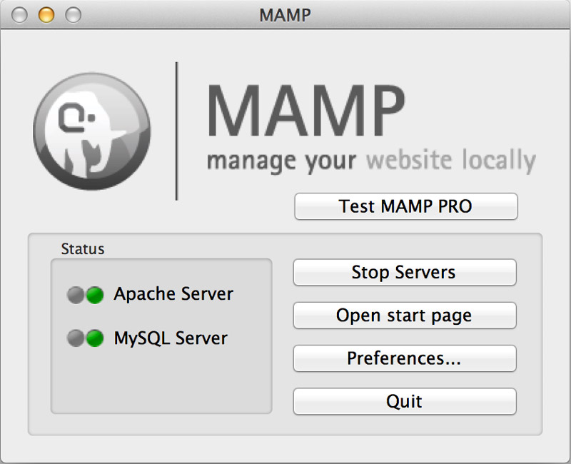
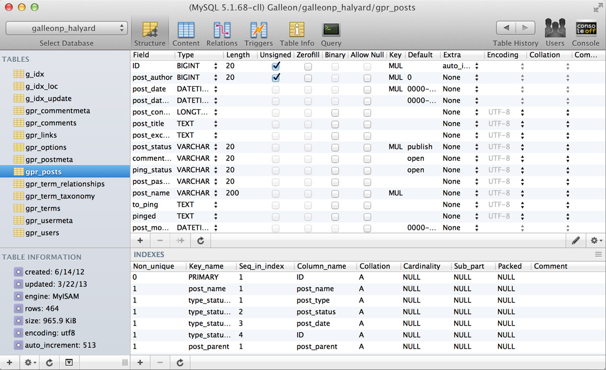
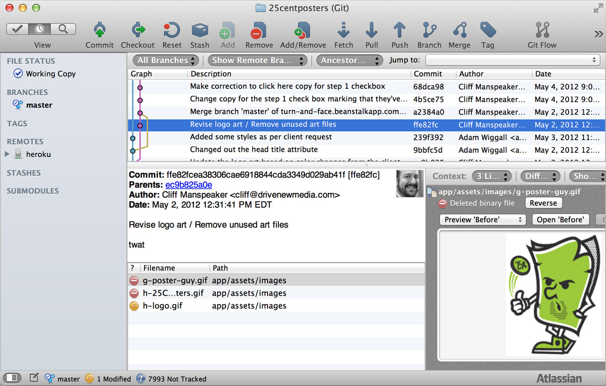
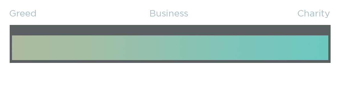
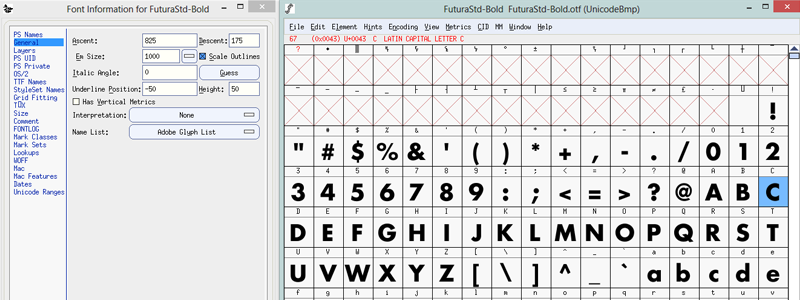
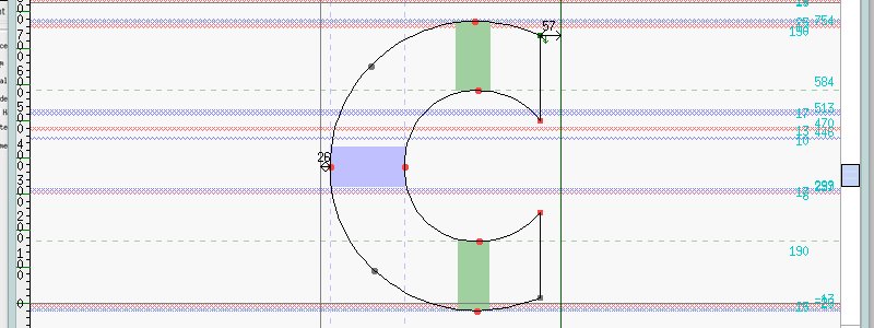 Um, what?
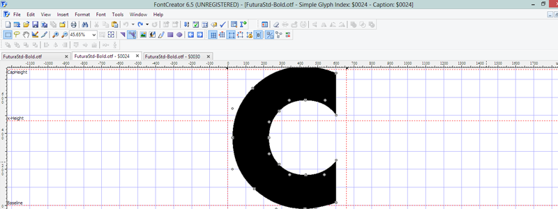 Ah, nice!
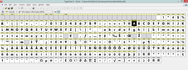
 Font-crafting perfection.
 Spoon Graphics ca. 2008–9, courtesy of the