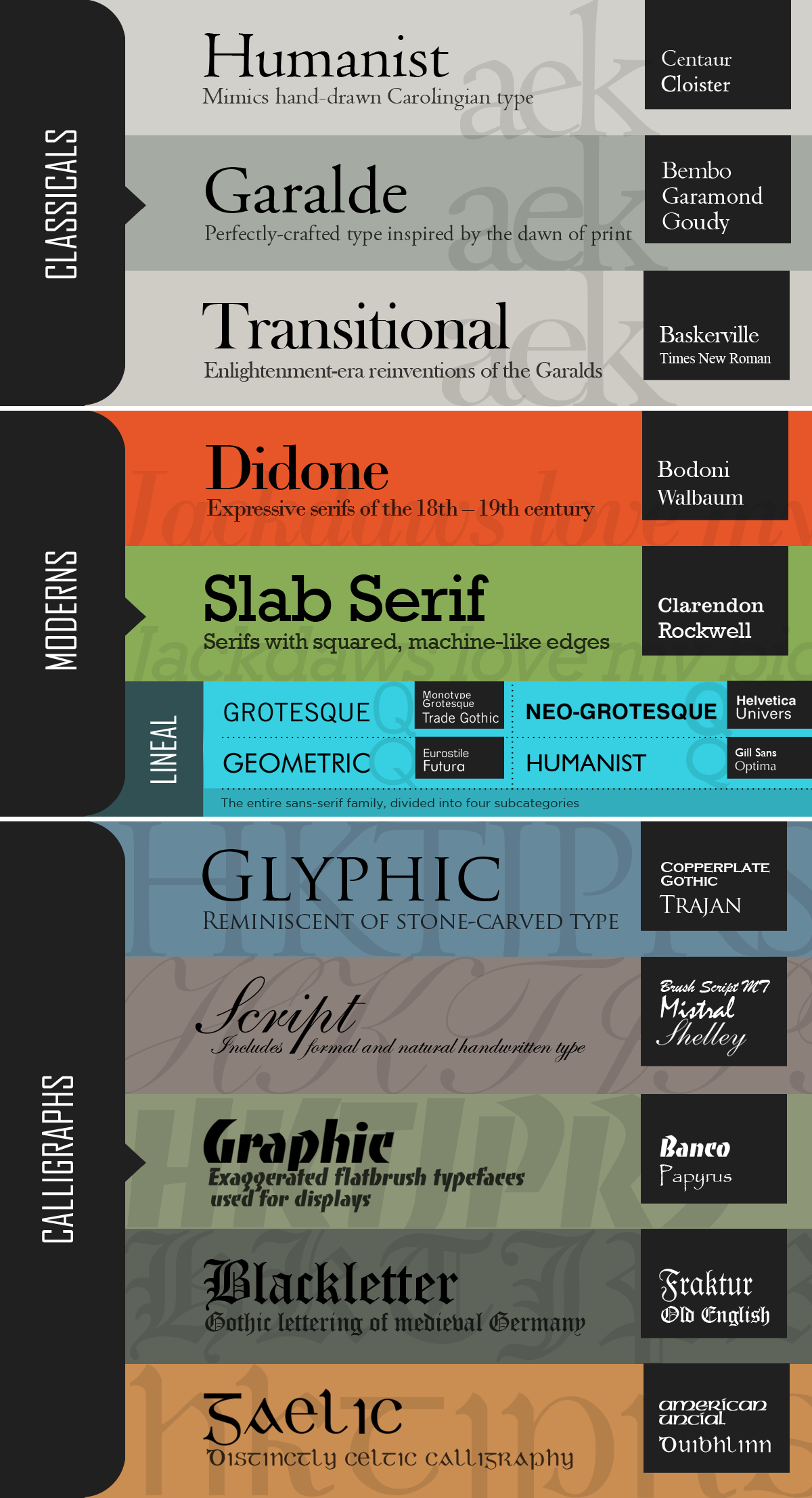
Infographic: Vox-ATypI Font Classification Chart

I’m not quite a typographer yet, but I’m trying to develop a greater sensitivity and appreciation for type design. This was as much a learning method as it was a design challenge. It helps me to organize information visually, and one of my goals as a designer is to present information in such an intuitive fashion that it becomes difficult, after seeing it, to present it any other way.
That wasn’t the case here necessarily, but I feel it is still a half-decent representation of Maximilien Vox’s classification system for typography.