Cy Cyr Photography


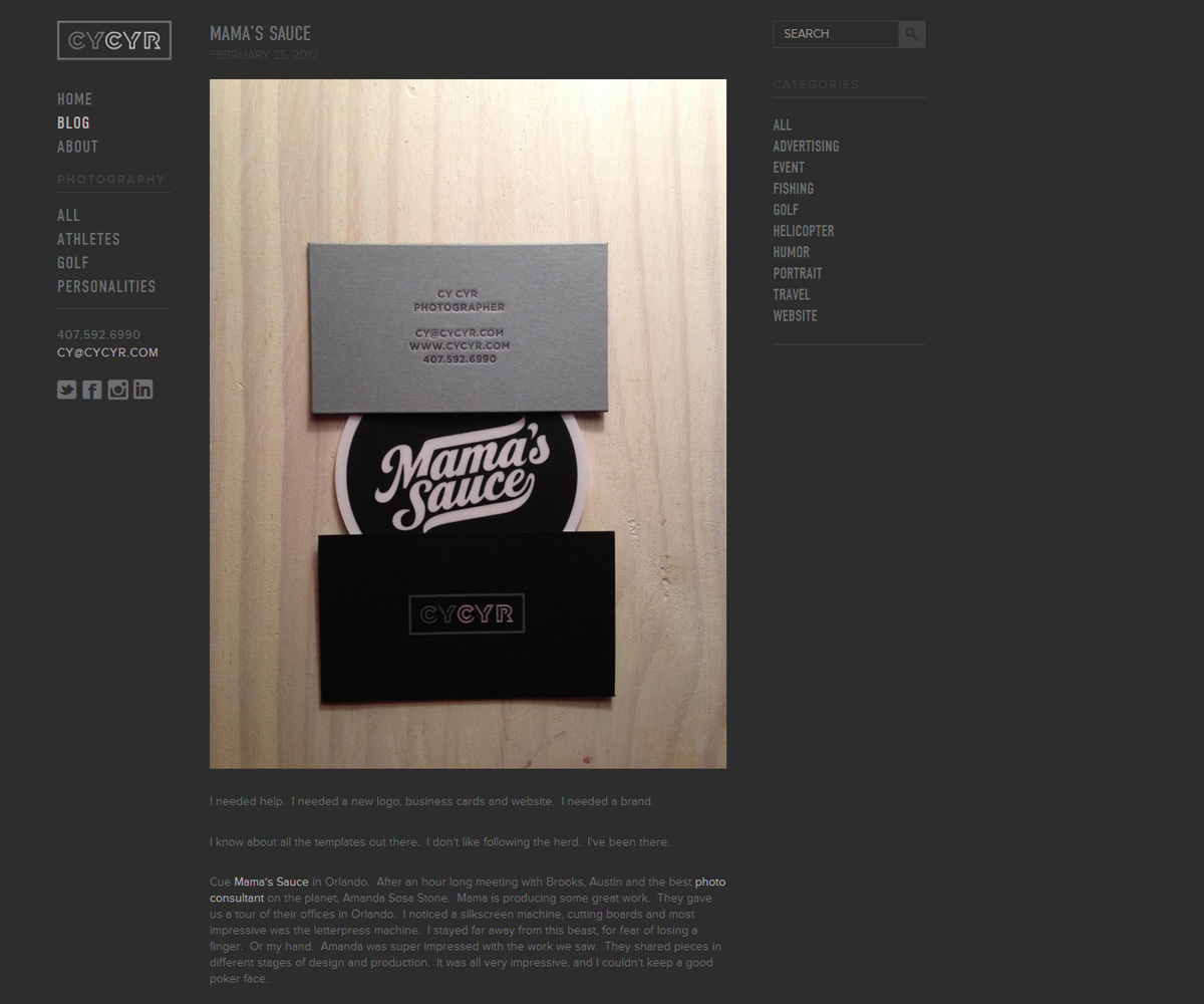
For this project I was incredibly blessed to work with Mama’s Sauce and Austin Petito on the design of Cy Cyr’s (sigh seer) photography website. He was referred to Mama’s Sauce to refresh his branding and presentation, and he wasn’t disappointed. I was brought in to implement the website for his bespoke identity package.
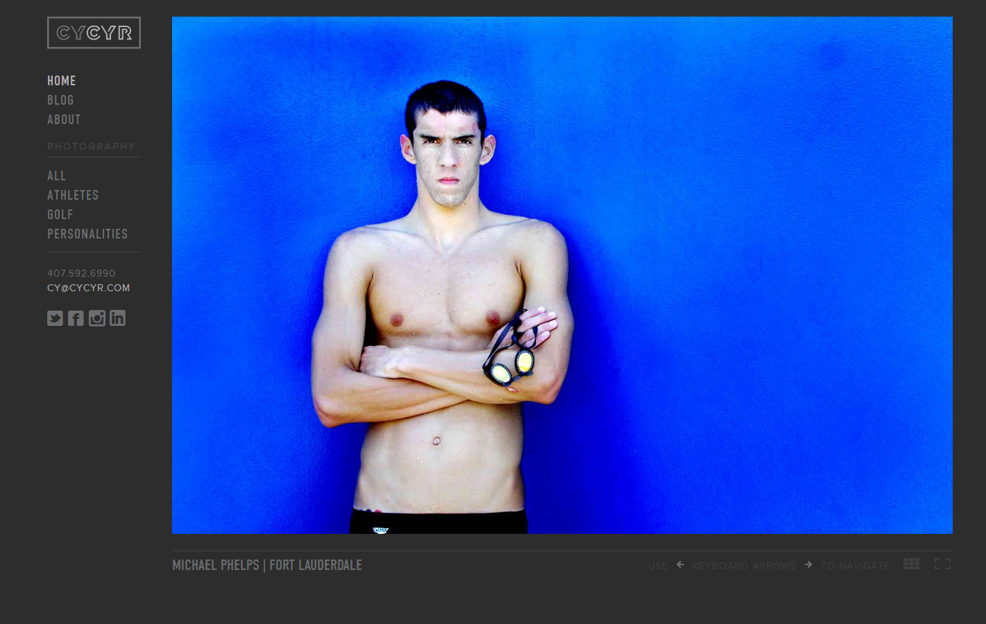
We consulted every photography website we could find, and created an exhaustive list of what we thought an online photography portfolio should and shouldn’t be. Naturally, we steered away from Flash, and for this project I suggested optimizing the site for Retina devices. Meaning, I built a site that features stunningly-beautiful high-resolution photography, without sacrificing bandwidth. I implemented a basic preloader to assist with that as well. Plus, all logos and icons on the site are either SVG or icon fonts, leaving the only rasterized part of the site to be the photography itself. In short, Cy Cyr’s photography looks the best it can on any device you view it on, and I haven’t run across any other photographer’s site with images as crisp as Cy’s.
Naturally, the site wouldn’t look half as good as it does without the interface talents and insights of Austin Petito, with whom I worked on designing and building the site.
Hopefully this won’t be the last photography site I do, but even if it was, I’d be okay with that.