Review: Windows 8

I upgraded to Windows 8 the weekend it came out, and I’ve had time to stretch it out over the past few weeks. I can’t remember being as excited about an OS upgrade as when I watched that beautifully-designed loading screen pop up, complete with Newton-cradle-esque loading wheels and vibrant, full-bleed color dialog boxes.
Upgrading from Windows 7 was genuinely enjoyable, rather than merely tolerable, and was pleasantly surprising how seamlessly it transferred. It asked me which programs / files / settings to keep, and after booting to Microsoft’s cutting-edge OS, I didn’t have any issues whatsoever. I had been following the blog for over a year, and I knew that the guts of it was largely in tact. But in this case, it’s the veneer that makes so much difference.
I’m not married to Apple or Microsoft, and I’m as comfortable working on one as the other. I have an iPhone and a PC, and I’ve worked on Mac OSX at my job for years. But for the first time, I actually feel like a designer working on a PC. It’s the aesthetic appeal that Microsoft is finally getting, and even if they are following in Apple’s footsteps in some instances, the fact that Microsoft is finally weighing in on design (and making its own hardware) is significant.
A breakdown of my usage of the PC:
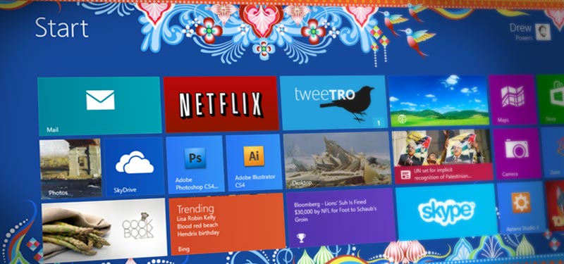
Start Screen
Should have done this a long time ago. There are some aspects of it that still feel unpolished, or have a bit of a learning curve (took close to a minute each to find the Shutdown button and the control panel). But with all the Windows apps searchable and displayed in one folderless grid, it feels as if they finally made a visual GUI that matches the efficiency of the age-old RUN command. I know they’ve had “search” in the Start menu since Vista, but they’ve made program navigation feel intuitive again.
Mail
I really wanted this to work. Really. I tried, but as it stands, it’s not a proper mail client. It is intuitive, well-designed, and I wanted it to be my end-all mail client. It does speed up my workflow, but it has problems connecting to mail, and I’ve watched emails with very small attachments sit in my outbox for hours with no notice, warnings, or any explanation whatsoever. I also don’t have a way to add/organize my folders, or archive old messages with a click, and above all, I can’t add email addresses to my address book straight from the app. If Microsoft took the time to fix these issues rather than promote Outlook.com, I would have nothing but glowing admiration for this app.
People
A great initiative on Microsoft’s part to center PCs around connecting with other people. This connects to Facebook, Twitter, and email accounts to pull contact information quickly into one central place. And while it’s both time-saving and forward-thinking, it misses the mark in some areas, mainly where it seems like it hasn’t ever used Twitter. Whereas my iPhone connects to Twitter to fill in missing info for my current contacts, Windows 8 assumes I actually want every person I’m following on Twitter to appear in my contacts. Any person who has used Twitter before will tell you this is not ideal. Aside from that, after all the time I spent hammering in my contacts manually (I don’t have Facebook), I’m not able to use those contacts in any desktop application thus far (namely Thunderbird, which I’m using because of the holes in the Mail app).
The Store
Haven’t spent a lot of time on here, mainly because the current useful Windows apps are slowly trickling in. But finding existing apps is incredibly easy, and I like the detail of merging the Store with Windows Update. Good job, Mikey.
Skype
So glad that Skype came out with this app! Being able to communicate full-screen, in a beautifully-crafted application is one of the gems of Windows 8 that makes it an experience unlike anything else available today. I’m not saying that Skype on other platforms can’t be blown up to fullscreen, but having the entire, start-to-finish experience bleed to every corner of the screen while retaining full functionality is what makes Windows 8 shine.
There are plenty of other great utilities, such as weather, Photos, and Videos, which I haven’t utilized much but are a welcome addition to Windows 8. Overall, I’ve been happy about the upgrade, and I’m genuinely excited to use my PC instead of pining for a Macbook some days. It’s encouraging to see Windows 8 push the limits of creativity to produce something that achieves the highest form of realization in program design: using every pixel of the screen to create an immersive experience, while still retaining complete usability. It’s a very hard thing to make a program ditch the toolbar and still retain workflow. And while there’s some give-and-take in every Windows 8 app, it’s definitely a step in the right direction that I think will blossom into a higher standard for everyone in the coming years.
